Artifact: Oldest House


Dairy Queen says Happy Tastes Good.
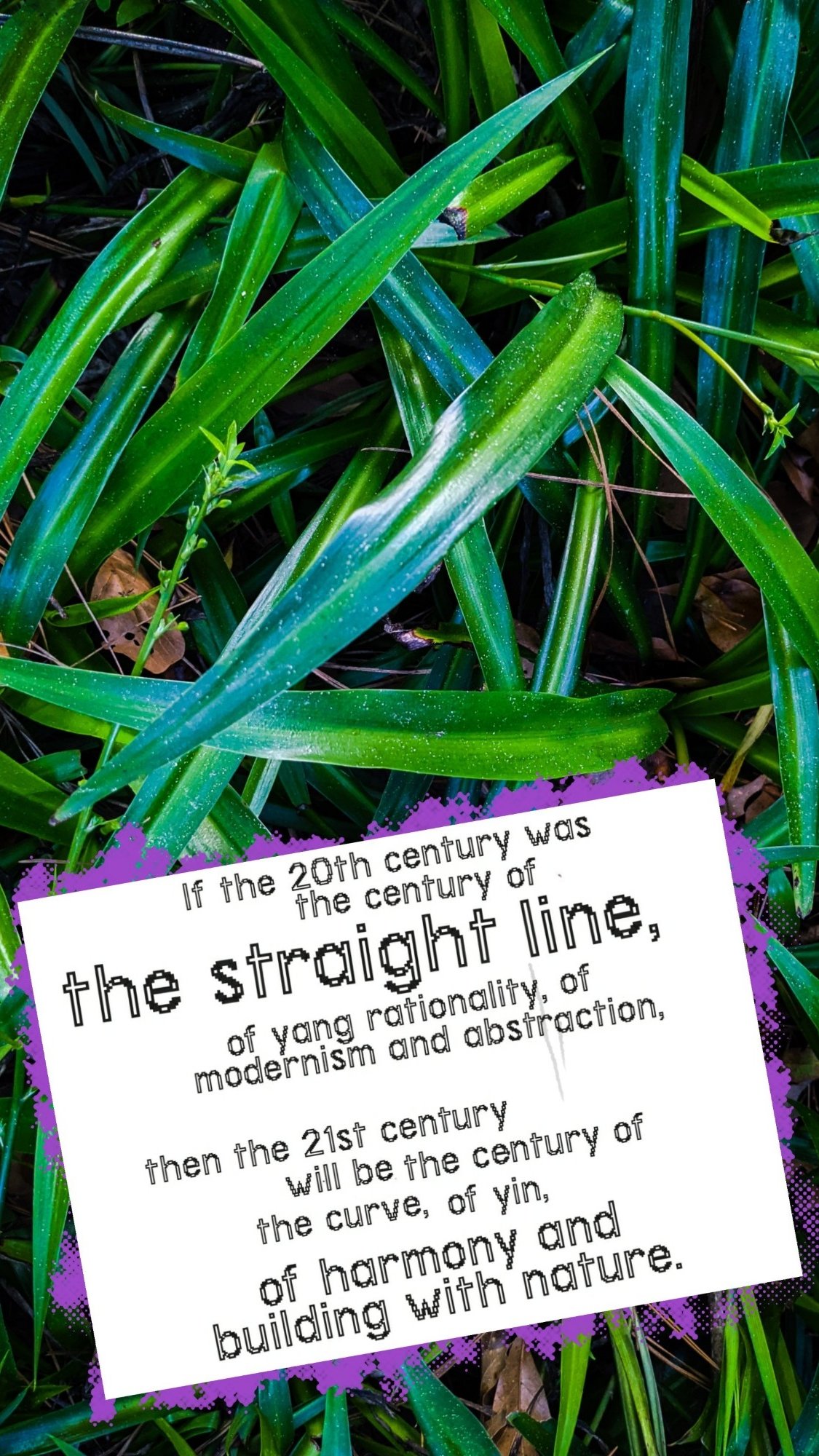
I have nothing with which to refute the argument, but it unsettles me anyway. Somewhere deep down, it feels like we’ve come too far by now to accept such a bald, simple proposition. It was something that may have been true for our parents once, but not us, and most definitely not now. Heavens no. Those days are gone.

I don’t know how to explain this cynicism, so I’ll try something easier instead. I feel confident asserting that “happy,” for us, now, must taste just a little bit real, a little bit off, to feel true.
To explain why, perhaps we could look at the spiraling dread that lurks beneath everything we read–surfacing at strange times, like in this seemingly innocuous pop culture article about why The Simpsons is no longer relatable that Digg thought I would enjoy reading to kick off my week. (They were wrong). Maybe it has something to do with the toxic dialectic of revulsion and self-reflection inspired by reality television shows like 1,000-lb. Sisters, in which two morbidly overweight sisters struggle with their emotions about food and exercise, or Shipping Wars, in which truck drivers underbid each other to win the privilege of hauling “unusual items” across the country. Maybe it’s Flip or Flop, where the money shot isn’t an orgasm but an itemized accounting of profits and losses surrounding the sale of houses that none of us will ever be able to afford at the end of each episode. This is entertainment for a brutalized populace, trained to cheer for the profits of the haves and despise the failures of the have-nots.
Maybe most of all it is because the line between entertainment content and lived experience is finally thin enough to have disappeared. We’re all content-creators now. We’re out here taking part in the flame war between Wendy’s and Burger King, infinite scrolling and hash-tagging our opinions for strangers. Your favorite creators–from presidents and royals all the way down to the TikTokker working at McDonald’s around the corner–are just as worried about maintaining their para-social relationship with you as they are focused on getting the camera angle and sound just right on that next shot. “Happy” is only happy when it is widely shared, but most of us must accept that the things we share will cast but a tiny ripple on the surface of existence. For the rest, the wider their “Happy” is shared the more must they face the fact that there are many millions for whom happiness is unattainable, millions more for whom it is impossible. Simple pleasures, networked and amplified, amount to something a great deal more complex.
With all that in mind, here are two alternative slogans.
In The Practice of Poetry, Robin Skelton argues that the poet’s “problem is finding out… how to detect the verbal excitements surrounding our perceptions, and how to discover in ourselves a confusion rich enough to compel us to investigate it.” Inspired by these words, I created a notebook (entitled, fittingly enough, “A Treasury of Verbal Excitements,”) to jot down all of the little bits of inspired writing I come across during the day. It’s helped me to be a more attentive reader and a more productive writer, so I highly encourage giving it a try.
We need not limit ourselves to verbal excitements, however. Why not visual excitements, audio excitements, culinary excitements? With that in mind, I started another notebook this weekend–“A Treasury of Visual Excitements”–and started filing away clippings that I liked. But why not share them here instead?
Here’s the first “visual excitement,” a beautiful clip from Ang Lee’s woefully under-rated 1991 film, Pushing Hands. This scene comes near the end of the film. The rest is beautiful in its simplicity, and in the space it allows its characters to fill, but this moment captured my attention and stayed in my head the for the rest of the evening. I love it.


“You’re branded, branded, branded, branded.” – Tom Peters
The first function of signcraft is branding.
Our time, incidentally, is the era of The Brand. The era of The Brand coincides with the rise of the internet. Branding existed before the internet—of course—but as our lives are almost completely mediated by screens now the brands surround us, assaulting our senses and needling their way into our thoughts from every direction, every surface. Even our relationships are subject to capital-B Branding. In 1997, business guru Tom Peters wrote, “We are CEOs of our own companies: Me Inc. To be in business today, our most important job is to be head marketer for the brand called You.” When we use the same tools, employ the same postures, and undertake the same motions to join a work meeting, find a date, chat with our friends, or order a meal, however, “to be in business” is synonymous with “to be alive.” The Era of the Brand is the Era of Business All the Time.[1]
We are encouraged, therefore, to cultivate a “personal brand” which we can use to manipulate our friends, partners, employers, clients, and associates. After all, “the greatest success stories inevitably involve people who stand out from the crowd.” A recent business book argues that we live in a “new world of new rules” where “mobile phones and digital technology give even average people the chance to build a brand around themselves.” To erect a sign is to mark the earth with a brand. Hence this blog.[2]
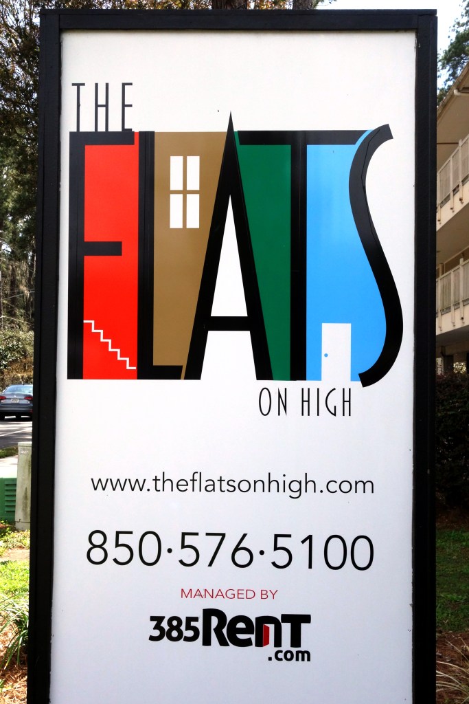
If branding is the first function of signcraft, narrative is the first function of branding. This example, a pylon sign for “The Flats” apartment complex, illustrates one of the ways in which narrative might be put to use. Brands are rarely honest, and this one is no different. This sign obscures.
First, the sign itself. Its high-waisted sans-serif fonts evoke a sort of friendly modernism at the nexus of art deco and children’s storybooks, while the bright colors spanning the spectrum from warm to cool signify a vibrant and diverse community. The architectural elements in the logo—the stairs, window, and doorway beneath the implied rooflines of the lettering—bring to mind a close-knit urbanism, like the Painted Ladies of San Francisco or the immigrant communities of old New York. Putting it all together, this sign implies that the community behind the sign is both urban and urbane, warm, vibrant, and modern.
What is behind the sign?
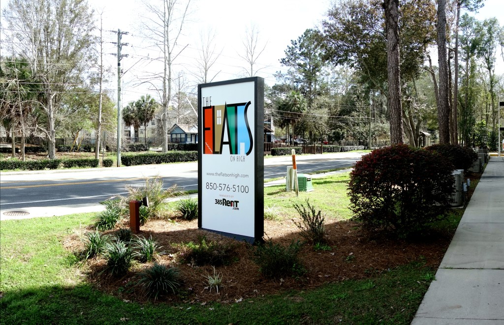
The architectural values of The Flats do not align with the implied values of the sign out front. Far from warm, vibrant urbanism, this array of hotel-style lodging perched on stilts above a parking lot is housing as a utility. Building on top of the parking lot is a clever use of space, but it cedes pride of place—the very footing upon the earth we all need to feel secure—to residents’ vehicles. In a city built to serve vehicles instead of people, at least this apartment complex and others like it completely surrender the earth to the cars. There is honesty, at least.


If architecture is meant to empower humans and shape their spirit through beauty and excellence, why do we relegate students living through the most formative years of their lives to the most utilitarian housing? Built and furnished with spartan commodities, colored with low-quality paints in neutral colors, student housing suggests to its inhabitants that home is something they will enjoy later. Now is time for something else. Landlords and designers would say it doesn’t make sense to spend more on student housing. The students won’t care. Worse, they will probably just damage the building, the furniture, and everything else. This is probably true. I’ve heard of students literally charging through the walls in their apartments playing football. They draw on the walls, clog the toilets, burn holes and spill drinks on the furniture. But how much of this is a self-fulfilling prophecy, I wonder? Do students recognize that landlords, parents, and university administrators treat their housing like a utility and consume it accordingly?[3]
Brands and their signs do important work to shape this complicated reality into a narrative. Student apartments here evoke fantasies of place and class—Tuscany Village, Villa Sienna, Chateau Deville, The Polos. Others evoke states of being—The Players’ Club, The Luxe, or, somewhat vaguely, Quantum. None of them match the stories they tell about themselves. This is what brands do because it is what humans do: name a thing, tell a story. But because these things are named and narrated to sell a product, and because the story these brands tell is meant to obscure the commodity relationship underlying one of the most fundamental part of a student’s life, the signs that tell those stories deserve critical attention.
In summary, The Flats is student housing. Its materials are bare commodities–vinyl siding and soffit, asphalt shingles, steel and concrete stairwells, steel piers—and the rich, vibrant colors on the sign are nowhere to be found. Beige, gray, off-white, and rust-red: this is American neutral, a building that withdraws from the eye and eludes memory. There are two ways to look at the reality behind the sign. On the one hand, it is a memory hole, a place that withdraws from mind and spirit so students can spend their time at home focused on other things. On the other hand, it is housing at minimum, a raw commodity meant to be rapidly consumed and forgotten, like a Big Mac or a rental car. Either way, reality belies the brand. The sign hides the thing signified. This sign is doing some heavy lifting.
This is the second entry in Signcraft, a series of posts looking at signs and the things they describe. You can read other Signcraft posts here.
[1] Tom Peters, “The Brand Called You,” Fast Company, August 31, 1997, Rob Brown, The Brand Called You (fastcompany.com).
[2] Susan Chritton, Personal Branding for Dummies (Hoboken, NJ: Wiley, 2014), 1; Build Your Reputation: Grow Your Personal Brand for Career and Business Success (Hoboken, NJ: Wiley, 2016), pp. 1-2.
[3] Another question, for another day, is: is student housing adversarial?