There is a spectre haunting the 21st century…
There is a spectre haunting the 21st century…
Another day, another provocation.

This is an idea I had in the shower Monday morning.
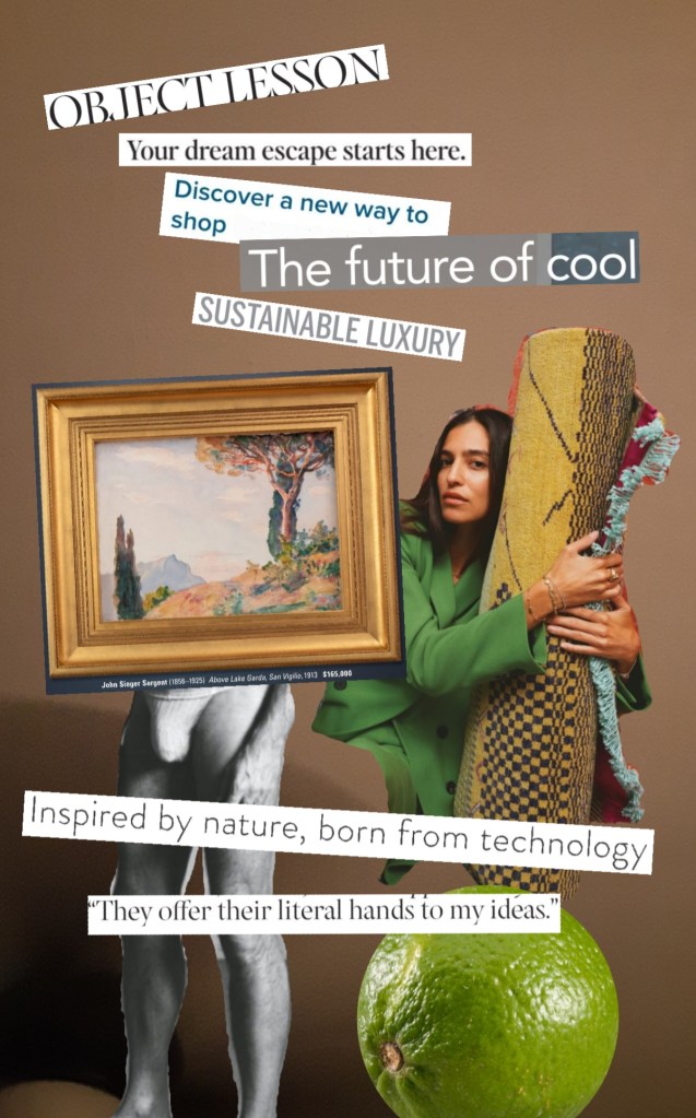
Since we’re doing the 2000s over again, it’s time to bring back Culture Jams. In that spirit, here’s my provocation for today.
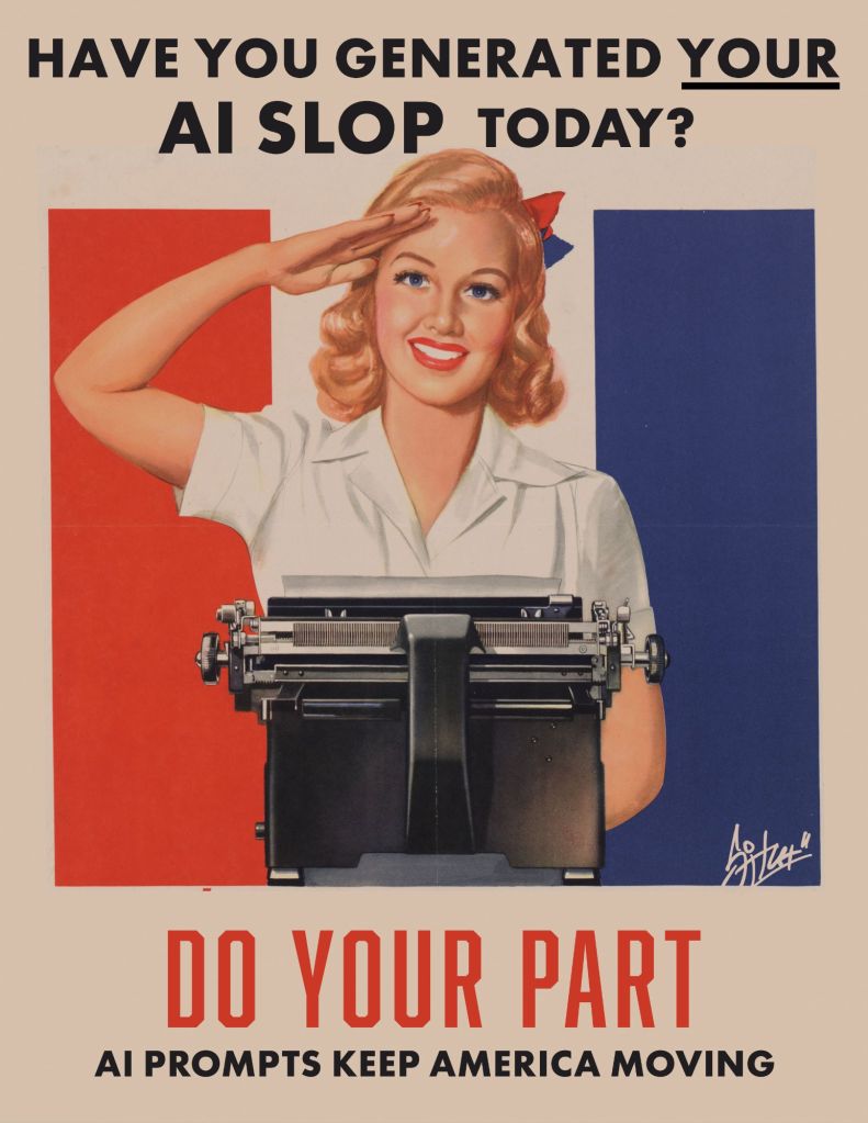
Here’s a little slop-aganda poster for you to post online or (better!) print and hang all over your hometown.
Do your part to keep those data centers guzzling and Hail Columbia!
I’ve been doing freelance design, taking photos, making art, building websites, and doing all kinds of stuff for more than twenty years. I’ve always thought I’d like to start a business for this stuff, but just never got up the courage to actually do it.
That changed tonight. I’m now the proud owner, er, Manager of an Alabama Limited Liability Company called Planet Glue LLC, and I have some big ideas–some old, and some new–for the company.


Right now it’s just a business card, a portfolio, a registered domain, an email address, and (most importantly?) a dream. I’ll spend the next few days building a website and some social media accounts.
When I was in grad school, I remember one day I was talking to my advisor about my plans for upcoming presentations and publications and he threw his arms in the air and shouted, “dominate!” (I love you, Dr. Frank. Never change.) That’s the energy I’m bringing to this.
Psychotronic Surrealism in Terrore nello Spazio/The Planet of the Vampires (1965) dir. Mario Bava


It’s been a while since I posted a Visual Excitement, but this warrants the effort. Some stills from Michael Powell’s 1963 made-for-TV adaptation of Bela Bartok’s opera, Bluebeard’s Castle.
It’s a zine about lots of stuff, including: art, architecture, poetry, photography, the South, Tallahassee, ghosts, and nature.
I made it.
I hope others will help me make the next one.