Since we’re doing the 2000s over again, it’s time to bring back Culture Jams. In that spirit, here’s my provocation for today.
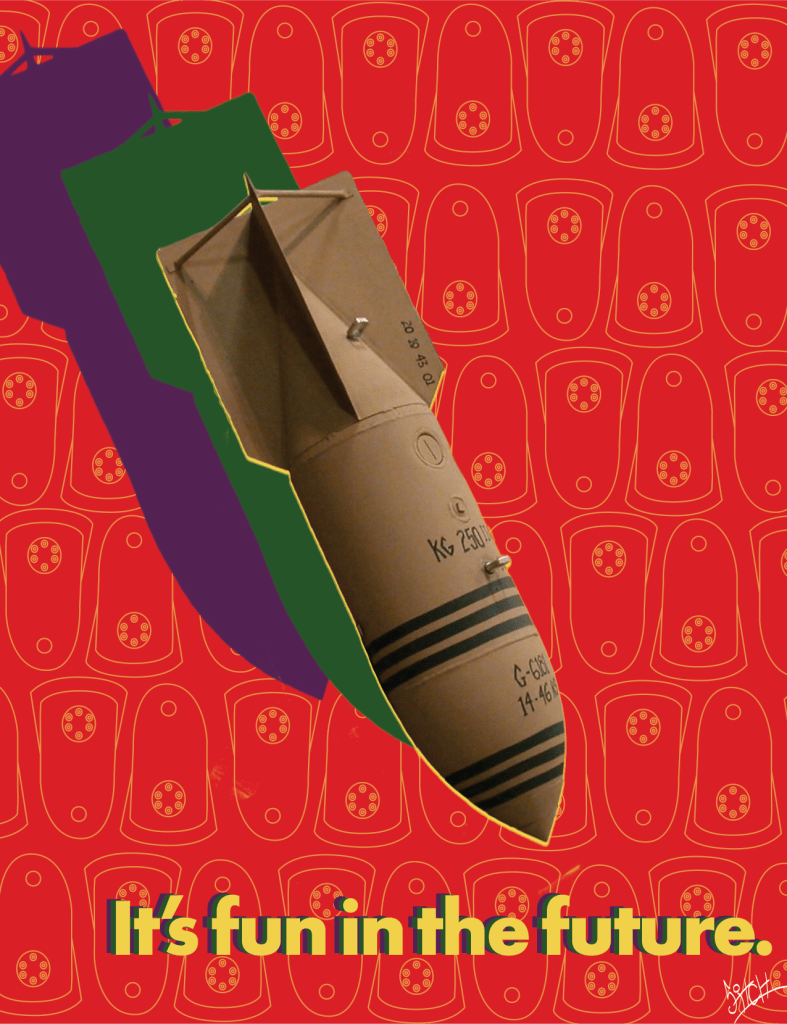
Since we’re doing the 2000s over again, it’s time to bring back Culture Jams. In that spirit, here’s my provocation for today.
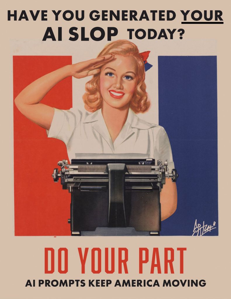
Here’s a little slop-aganda poster for you to post online or (better!) print and hang all over your hometown.
Do your part to keep those data centers guzzling and Hail Columbia!
I’ve been doing freelance design, taking photos, making art, building websites, and doing all kinds of stuff for more than twenty years. I’ve always thought I’d like to start a business for this stuff, but just never got up the courage to actually do it.
That changed tonight. I’m now the proud owner, er, Manager of an Alabama Limited Liability Company called Planet Glue LLC, and I have some big ideas–some old, and some new–for the company.


Right now it’s just a business card, a portfolio, a registered domain, an email address, and (most importantly?) a dream. I’ll spend the next few days building a website and some social media accounts.
When I was in grad school, I remember one day I was talking to my advisor about my plans for upcoming presentations and publications and he threw his arms in the air and shouted, “dominate!” (I love you, Dr. Frank. Never change.) That’s the energy I’m bringing to this.
Earlier this year I stopped by the SCAMS studio in Tallahassee to lay down a bass line on my friend Gamble Cosmos‘ new track, “Helene Serene.” It’s a great song, and I had a blast throwing down the bottom end.
Later, I was thrilled when Gamble asked me to contribute even more to the project by creating original cover art for the track’s release on Bandcamp as a “double A-side 7-inch” with another Gamble Cosmos single, “Kew Gardens Contigo.” We talked about some of his inspirations–hurricanes, ’90s shoegaze records, old 45s–and went over some of his other artwork for consistency’s sake, and then I was off to the drawing board.
I’m mostly satisfied with the results.


Here’s the record.
A poster you can print for fun and profit.

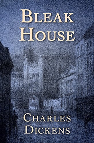
Trying my hand at book cover design with a classic.

This is a difficult one to capture with a cover. The tone, themes, and plot do not necessarily match the title, but the book is so full of life and characters that anything short of a parade fails to capture its vitality. With this design I am leaning into the title itself.
Other designers appear to have made the same choice with this one.


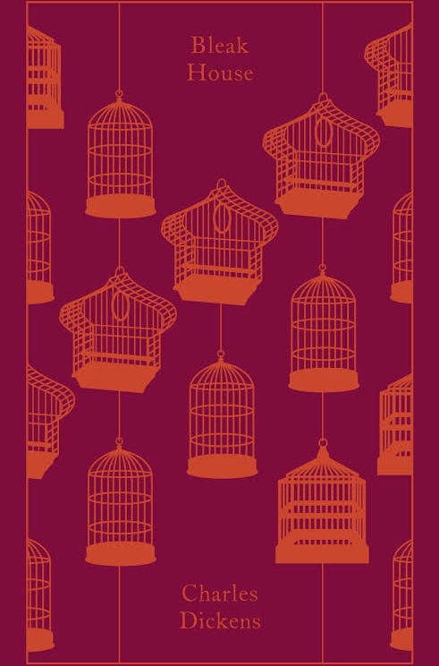
I’m much more fond of the Vintage and Penguin editions below, however. These are much more engaging and do a better job of capturing the story’s themes in a glance.

I still have a lot to learn about cover design, but I think this is a pretty OK first outing. Authors: if you’d like to work with me on a design for your book’s cover, get in touch!
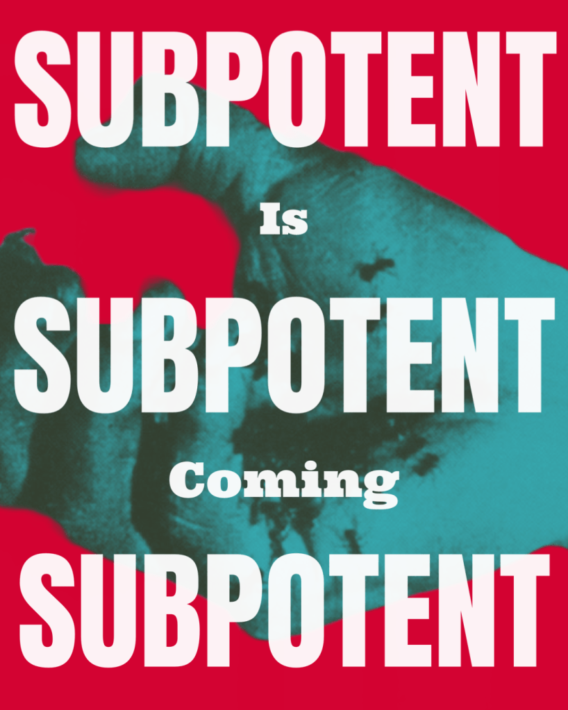
This post is a little bit about art and a little bit of self-promotion. My new band, Subpotent, is shaping up. We are almost done with our first set and getting ready to start playing shows in Tallahassee!
To start building awareness, I designed this poster inspired by surrealist art, situationist technique, and propaganda. This design reflects the band’s aesthetic and (I think) powerfully imprints the message with the combination of strong color, bold type, and an arresting image stolen from the Dalí/Buñuel film Un Chien Andalou.
After watching this film last night at our incomparable local independent video rental store and theater, Cap City Video Lounge, I came home and asked myself: what if Kathryn Bigelow’s 1987 vampire feature Near Dark was released in 1967 instead of 1987? Then I stayed up way too late and made this poster.

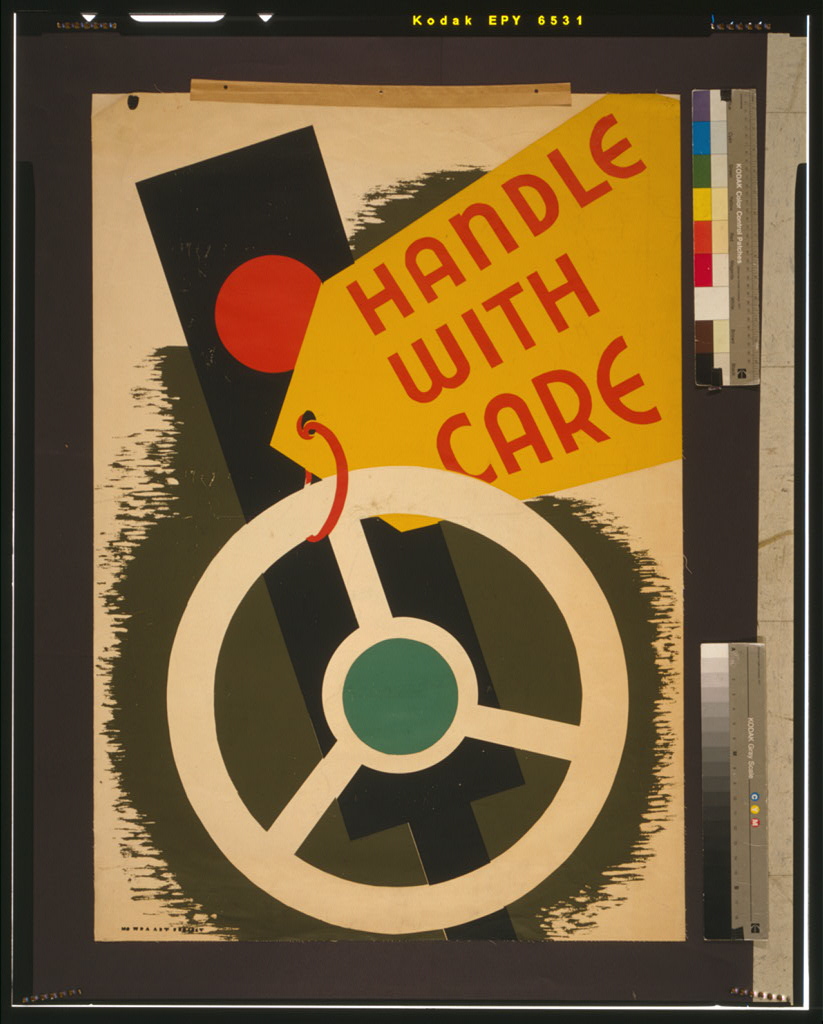
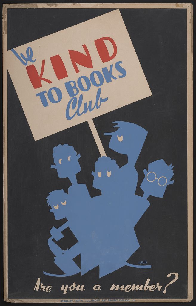
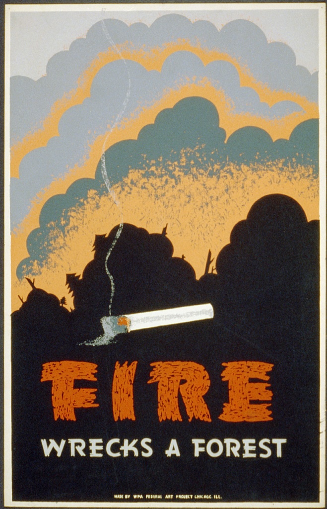
I just randomly stumbled across this collection of WPA-designed posters at the Library of Congress and, just… wow. Every item in the collection is cool, ultra modern, progressive, clear and concise. Almost all of them have something to teach about good design. I even love the bad ones.