In Grafica della Strada, designer Louise Fili lovingly documents the wildly creative shop signs, billboards, and other signage of the Italian street. “In the hands of a sign craftsman,” Fili writes, “type took on a new life, with a tantalizing menu” of styles, materials, and techniques. “Many of the signs proudly bore the imprimaturs of their makers” she explains. All of them are beautiful and inspiring.
Inspired by Fili’s valentine to Italian signage, over the years I began looking around for examples of well-crafted or creative signage here in my little southern hometown. To put it mildly, I’ve been disappointed. American streets certainly match their Italian counterparts in quantity. We are surrounded by signs, assaulted by their messages all day. When it comes to variety or creativity, though, our humble American streets leave much to be desired.
The problem, I believe, is one of commodification and transportation. What makes the signs in Fili’s book so wonderful are the myriad personal touches, the unique lettering, the diverse materials. They catch the eye in spaces that operate on a human scale, like pedestrian areas and urban centers where people move slowly. American signs must catch the eye on the scale of the automobile. Just about every sign here seems to be a sheet of printed plastic hung in front of a bank of lights, therefore, towering above the street where it can be seen from a distance at a high rate of speed. Signs are manufactured to corporate spec by franchisees for many businesses. In almost all cases they are manufactured using commodity materials, a limited design language, and industry-standard methods. It is a competitive business with precious little room for experimentation, serving customers with precious little appetite to break the norm. As business moves more online, I suspect this trend will only worsen.
Or so it appears. I’m willing to believe that this is a superficial reading of the American sign landscape, and I hope to prove myself wrong on this blog.
I’ll start with an example that is not beautiful, necessarily, but is remarkably different from the norm. I spotted this sign at the entrance to an “established” (that means old, in real estate terms, but not old or special enough to be “historic”) neighborhood on the opposite side of a busy road headed out of town. I swung around to take a few pictures, but could not find a good place to pull over until I spotted a side street a few hundred yards down the narrow entrance road. This gave me an excellent opportunity to walk through the neighborhood. The sun was shining warmly, and birds were singing songs of early spring in the trees overhead. Homeowners along the street have added, over the years, little hahas and embellishments to their yards. The neighborhood was peaceful, lived in. Alain de Botton argues that “those places whose outlook matches and legitimates our own, we tend to honour with the term ‘home.'” To call a place “home,” he says, is “to recognize its harmony with our own prized internal song.”
I was easy to see how Runnymede is home for its people. This sign was not as handsome as it may have been thirty years ago, but it speaks to the unique character of the community it represents. Perhaps it “sings” their “prized internal song.”
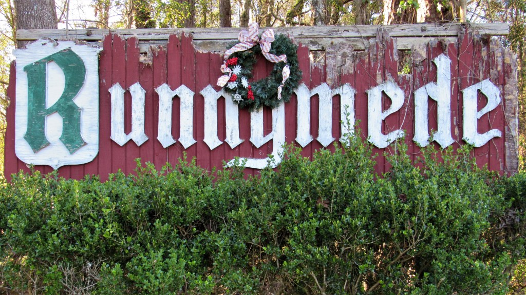
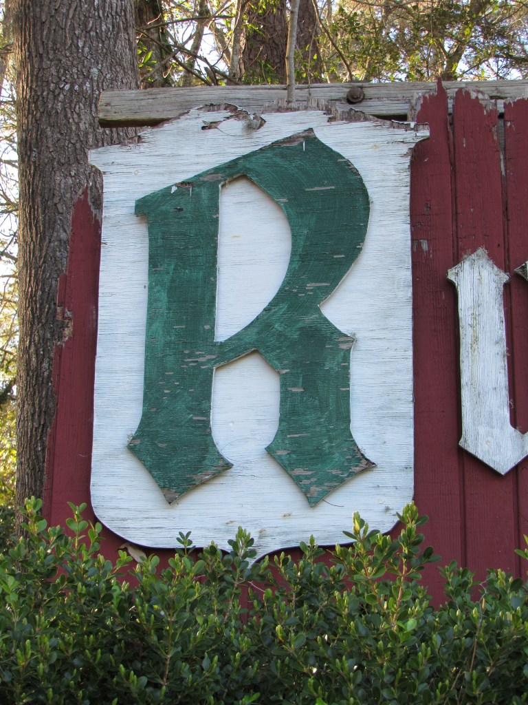
This is the first lesson in my study of American signage. Context is important. John Dewey rather famously wrote: “When artistic objects are separate from both conditions of origin and operation in experience, a wall is built around them that renders almost opaque their general significance.” A viewer cannot fully understand art unless they see it in the place and form in which it was meant to be seen. A sign is meant to be seen in a particular place. That is its purpose. Its value as a work of art is way down the list of priorities. I regret now that I did not do a better job of capturing this sign in context.


