The Last Human Milestone

Do you feel that? That creeping sensation that something isn’t quite right?

  • Maybe it’s when text buffers in multiple Windows apps randomly stop accepting text until you reset the application state – like pressing “Save” or restarting the app. (Maybe, especially, it’s when this happens on multiple computers in different apps on the same day – so you know the issue isn’t limited to one machine.)
  • Maybe it’s when Outlook on Android takes you to the last email you received instead of the newest one when you open the notification for the new one.
  • Perhaps you feel it when you are reading over some text a colleague wrote and everything is making sense until, out of nowhere, there is a wild inaccuracy on some small but foundational thing.
  • Perhaps it is when Evernote opens the wrong note when you click on the one you wish to open, and you have to click twice and wait a moment for the application to sort out with the database what the heck you’re actually looking for.
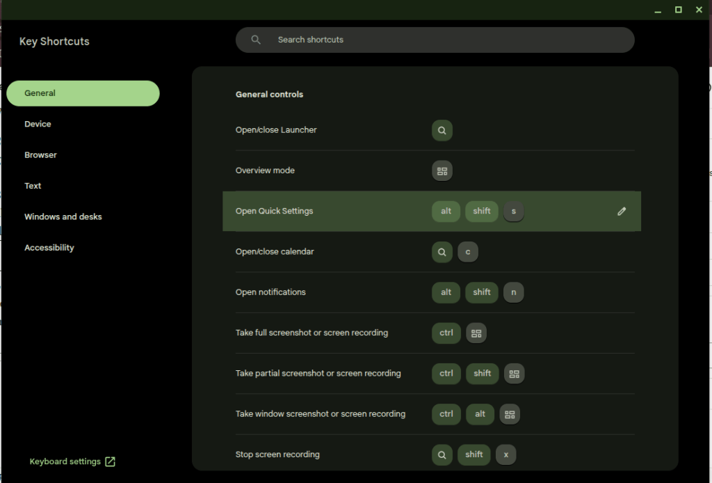
  • If none of these, maybe it’s when you’re looking over an infographic and you see some small thing that doesn’t make sense, like a line that randomly ends before it should, or some garbled text.

These are basic problems—how to handle a text buffer, which record to open when a user clicks on its representation in the UI, whether the company you work is a Gold or Platinum (or Golden?) Business Partner, how to draw a line from Point A to Point B, and so on—which, until recently, have long been solved. Imagine the creeping dread, then, when they all happened to me yesterday.

Thinking about it at the end of the day, writing in my old-fashioned paper journal, I wondered: Did AI do this?

I suspect the answer to this question is yes. I know AI is responsible for the problems with writing and infographics, and I strongly believe it is responsible for the application bugs, but even if it isn’t, walk down this road with me a little ways. I think it leads to an interesting place.

Consider a few signals in the noise. First, AI coding agents are pushing and pulling Github so hard that the service is regularly crashing. Microsoft is working hard to dedicate infrastructure to the new demand, I’m sure; but the demand, for AI users to stress the platform harder than ever before, will remain for as long as the current craze for AI agents persists. Second, every major software vendor is moving toward (or has already arrived at) an AI-first approach to coding. These companies aren’t doing this because they want more code, or at least that’s not the main point. What they really want is fewer people writing the code they plan to ship to customers, so they can deliver the same level of service at reduced cost.

This means that those engineers who remain have fewer colleagues to check their work and fewer incentives to write their own code. It means that the code they have to review was mostly produced by an opaque mathematical algorithm attempting to predict what a human mind might do, given a certain problem, and not a human mind itself. It means that the machine they have to reason with when there is a problem with the code is trained to agree with them and then try the problem all over again. It doesn’t learn anything, it simply chirps a response which is likely to work. And, crucially, the response does work most of the time. It’s a miracle. The machine generates code that works; it’s nearly instantaneous; it passes all the tests; and it made the engineer feel good about what it was doing along the way. No one really needs to understand it, because it is working and I can follow it superficially, and no one needs to own it—I mean in the intellectual sense, to own it the way an author owns their text or a mechanic owns their machine—because they can’t. They didn’t make it. They didn’t twist the wrenches.

Now put it all together. AI is writing more code than humans, it is shipping in major applications that we use everyday, and no one really understands the myriad ways that it interacts with the other code in the application (or the operating system) because there are fewer hands on deck at the major software companies to check it.

A similar problem exists in the vast universe of texts which shape and condition our world. Consider a few examples of how this can wrong in a software implementation project.

  • A resource-strapped government agency requests proposals for a new system and uses a combination of AI-generated text and copy-pasted text from the last proposal to create the new one. These may or may not make sense.
  • The proposer uses AI to generate their response. It gets most things right, but introduces some strange errors which misrepresent the solution. These are buried deep in the text, and it all sounds plausible, so the human reviewer misses the error.
  • The government agency uses AI to summarize the proposals. It may even ask AI to make some recommendations about the best ones. These machines incorporate the errors into their review and summarize or recommend accordingly.
  • People on both sides of the deal use Google AI overviews to research their answers to questions that come up during negotiations. These are often right, but the devil is in the details, and the AI overview doesn’t understand the context because it’s a prediction model.
  • AI creates the training manuals for the solution. The algorithm cannot generate text from what was actually built, only what is in the training data. A person must bridge the gap. Do they know the difference? Do they have the time, energy, and motivation to care?

I know that software code and the projects that put it in people’s hands have always been full of bugs and hampered by problems like this. The difference, I wish to suggest, is that someone in the past was intellectually accountable for these problems. A person wrote the code; a person wrote the document; a person mastered the material to the best of their ability, thought about it, and then formulated an argument as to how it should be applied to the world.

Software bugs emerge from strange circumstances. A person, while thinking through the problem, has time to consider these circumstances. If they’re writing code they will try and fail, try and fail, again and again and again, until it works. Sometimes they will encounter the circumstance directly. Sometimes they’ll think about it when they get up to use the restroom. The point is, every time they fail, they have to think about the problem; and they have to keep thinking about it until the problem is solved. It takes time, and it takes pain, but when they come out on the other side they have understood it, by God, and they can be accountable for it.

Writing is the same. A writer sits down at the keyboard or the legal pad with a vague idea, like “I think AI is breaking the world,” or “I think the French Revolution was caused by the frustrated bourgeoisie,” or “I need to explain how to use this software,” and then they have to struggle, word by excruciating word, to explain themselves. They have to read and take notes and think; and then like a coder they have to try and fail, again and again, try and fail, to read the right stuff and take the right notes and put words and evidence together in a way that will explain the idea. Along the way they will have thought about it so much that they likely never want to think about it again. But they own it. Ask them about it and they can answer you in detail.

That world is gone.

There is a strong possibility, therefore, that we are standing on the brink of a giant and terrible pit of despair that is likely to break more than just the text box on Microsoft Teams. The problems are going to proliferate, and then they are going to cascade. Systems will get worse. Some of the problems will not be revealed until people die as a result. No one will really know how to correct the bugs because no one will have owned the code in which they were introduced. When an engineer delves into the problem, fixing the bugs will be like playing whack-a-mole, because Function X was written by Claude Code using Opus 4.5 and interacts with Functions Y and Z, which were written by an engineer in 2011, who is now retired, and Claude Code running Opus 4.7, respectively; and all three were included in code that was re-written in a more efficient language by another AI agent last quarter as part of an attempt to gain some memory overhead on the virtual machines running the app. It’s a nightmare, and production can’t simply stop while they figure it all out. The AI agents will be making code changes along the way because the managers have to keep up with their KPIs.

That’s just software. Books, music, art, and movies are another thing. All of them worth the same thought experiment.

Faced with a deteriorating product experience and unhappy customers, companies will face a difficult choice: keep patching the bugs while shipping new features and hoping for the best, rip out the problematic AI-generated code and let humans re-write it, or blow up the code and simply start over.

In any event, I think smart companies by the end of this year will be thinking about the Last Human Milestone. Think of that as the last point when humans wrote all of the changes shipped in the product. For many companies the LHM is now almost five years ago. But even then, in 2021, early users of Github Copilot were still mostly in the pilot seat. The tool could generate some code, but the human had to own the overall solution. For most companies, I think the LHM was probably in late 2025. This is when Claude Code exploded and the rhetoric around AI coding agents shifted from probability to inevitability. Capital follows rhetoric, and we are now, I believe, starting to see the results.

Yesterday it was a creeping sensation, a few momentary glimpses into the void. Tomorrow that creeping sensation may burn like sciatica. The Last Human Milestone will be a starting point for the difficult decisions we all must face. Can we go back?

(Update, the next day: Here is newspaper columnist Dave Barry struggling to convince the Google AI Overview LLM that he is still alive. Notice how it gets more and more wrong with each attempt to solve the problem.

Update, the next, next day: “I’m going back to writing code by hand,” one developer writes, because “AI writes features, not architecture. The longer you let it drive without constraints, the worse the wreckage gets.)

Dots on the Map

Last week I saw a frightening thing.

Last week I saw a tech demo for an open source mapping library. Imagine a dark wireframe map, black and purple and yellow, different shades of gray, the kind of visualization that looks slick like science fiction, even now, in 2026. At the center of the map: a pizza restaurant in a Florida college town. Gray roads spread out from the franchise like a spider’s web, connecting it with the towns and cities of the southeast. Click a button and little 3D boxes appear on the screen, each little polygon representing one of the burger joints, tire repair shops, big box retailers, houses, or apartment buildings surrounding the pizza restaurant. Click another button and outlines appear on the ground—geofences. The one surrounding the pizza franchise glows dark orange. Click the next button and little yellow dots appear on the screen, dozens of dots, all within the dark orange glow of the boundary surrounding the pizza restaurant. Each one of these dots is a cell phone that pinged a tower from inside the geofence. Each one of these dots is a person.

Click another button and purple dots appear on the screen. Some of them are close to the pizza restaurant. Some of them are far away.Each one of these dots is where the phone represented by one of the yellow dots “spends the night.” Each one of these dots is a person’s home.

Click another button and the number of yellow dots increases again. Each dot shows a point in time as one of the cell phones in the first shot made its way to the pizza restaurant. String these dots together and you can trace the route each customer took to reach the restaurant.

Move a slider representing time at the bottom of the screen and the number of yellow and purple dots increases. With enough time, the tracery of yellow dots marks out the road map of Florida. Add more time and it traces a road map of the eastern seaboard. Can you guess what lies at the end of those yellow brick roads? Little purple houses.

Right now, then, any random business owner can buy a map that leads from a customer at the register back to that person’s bedroom. It doesn’t take much to connect a point on the map to a street address; an address to a name. I’m sure this trivial step wouldn’t be necessary, though, because the data broker who provided the underlying phone data will gladly sell the phone number, too. Phone numbers leads to names and addresses; names lead to background checks, consumer profiles, credit reports, recent purchases, web history, likely political affiliations, social credit scores; one name to another name, a graph of connections leading from a dot on the map to the very essence of who you are – at least as far as data brokers can gather.

I think we all understand, in a cynical way, that this is happening. But seeing it, watching the private lives of people who simply wanted to eat pizza for lunch unfold on the screen before my eyes, cut through the veil of cynicism.

We are living in the worst case scenario. It is a frightening place to be.

(Note: The WordPress AI Assistant thought this post would be improved by the addition of tags like “short story,” “fiction,” or “science fiction.” I assure you, reader, AI and human alike, that this shit is non-fiction. – CBC)

Chromebook UX is Terrible

Maybe the title is hyperbolic.

I love Chrome OS. I am thrilled that there is a team out there making opinionated choices about a computer user interface that isn’t just a slavish copy of Mac or Windows. I’ve been using little workhorse Chromebooks like the one I’m using to type this post for more than ten years and I will continue to use them until Google puts Chrome OS in the graveyard.

I don’t always agree with Google’s opinions about how I should use this machine, though, and I lament some of the compromises they’ve made to enforce those choices. Here are a few lamentations off the top of my head.

  1. The desktop is useless. I get that many people don’t like cluttered desktops, but let’s take a moment to think through the analog before we throw it out. The purpose of the desktop (in my opinion) is to keep the things I use frequently ready-to-hand. On the Chromebook, the desktop is just a blank expanse of nothing. I can’t put apps there, files, links to apps or files in the browser–nothing. What a colossal waste of geography.
    Why, yes, that is the wallpaper from the old Nexus 7…

    2. The Tote makes no sense. What is it? What goes there? Where am I toting whatever goes in there from, and where are we going? Why does it appear sometimes, but not always?

      3. Some “apps” open on a new tab in the browser; others open in their own window. I’m not talking about Android apps installed from Google Play. I mean shortcuts installed as apps. Blame me. I did something wrong to make this happen; but, uh, shouldn’t it be hard to make that kind of mistake? Aren’t these things used by millions of kids for their schoolwork?

      4. Google loves installing stuff on this machine without asking me. With each of the bi-weekly required and self-initiated updates, it seems, the teams at Mountain View have got some new ideas for me to try. Sometimes these ideas mean they need to install new apps, like Gemini or Google TV, and

      5. Many of the useful keys people want on a computer have been replaced with useless buttons. I’ll trade the Fullscreen and Refresh buttons for the “Home” and “End” keys. Google knows this is a problem because they had to build the whole app in the screenshot down there to explain the arcane grimoire of shortcuts needed to replace the keys they decided I don’t need.

      Thank goodness I can put this browser window in Fullscreen mode at the press of a button, though.

      That’s enough for now. I don’t hate the player; I hate the game. I want to make my own decisions about how my computers should work, and that’s not the game for a cheap Chromebook. That’s what Linux is for, no?

      Still, absolutely nothing on the desktop? Really?

      Adobe Acrobat is a Hot Mess of Ads (and it’s not alone)

      I pay $20 a month for the “privilege” of editing PDFs.

      I understand there are other solutions that allow me to do this for free or at a fraction of the cost. I’ve tried many of these over the years and found that Adobe’s solution works best for me as a production tool. Having reached that conclusion, I don’t mind paying for it.

      Lately, however, Adobe is making it hard for me to continue paying this fee. Every time I open the app, close the app, or even just move the mouse to the wrong portion of the screen, I am bombarded with advertisements.

      First there is the startup ad. The first time I open the app, every day it seems, I’m presented with a popup detailing new features I might be interested in trying. I must engage with this ad, either positively or negatively, to proceed. It’s like a little toll my brain must pay to start working with PDFs.

      (Note: I had already cleared the irritating popup which prompted this post yesterday before I had a chance to grab a screenshot. I knew that if I came back today I would get a new one, and bingo! there it was.)

      Checkout this fun popup that I’m paying to see!

      Thankfully I don’t need to close an ad like this every time I open the app for the rest of the day, but every time I open a document, I can be certain that another dialog recommending an AI summary will appear at the top of the screen. Let’s leave for another day the question of whether an AI summary is good for me, good for society, or whatever. Today I am irritated by the simple cognitive labor I have to do every time I open the app to work, to learn, or even just to read for fun. This dialog doesn’t obscure the document, but it consumes valuable real estate on my screen that I often can’t afford to give up. I have to think about it instead of what I’m reading.  

      Here’s a super-cool dialog that is just big enough to be a distraction. Yay!

      After I’ve closed this dialog, I’m still not done dealing with distractions. If I make the mistake of moving the cursor to the bottom of the screen, another dialog appears. Not only does this dialog require another little jolt of cognitive labor to acknowledge and clear the distraction, it creates a slight disincentive against moving the cursor while reading. Worse, this one obscures a portion of the document for a second or more after I move the mouse away from the Hot Zone.

      This thing… this thing just really gets under my skin.

      There’s something else about this dialog that drives me crazy. It activates a feature that is already controlled by a button at the top of the screen.

      Here is the button that is supposed to activate an AI Assistant dialog like the one (but not the same one?) that automatically opens at the bottom of the screen when I move the mouse to the wrong place. It’s got fun colors!

      If I wanted to use this feature, I would click the brightly-colored button at the top of the screen! This drives me crazy because the application shouldn’t just execute a command on my behalf – especially not when it has recommended the feature on startup and then reminded me of its existence again and again with popups, dialogs, and colorful buttons. Don’t treat me like a stubborn child who needs to be forced to eat his vegetables. You say you don’t like it, Adobe asks, clearly the wise adult in this exchange, but have you even tried it?

      What an insult.

      On this computer I pay the bills. If I want to use the damned feature I’ll damn well click the damned button.

      This insult poses a philosophical challenge as well. Ask yourself: when is it OK for a machine to operate itself? The deal we’ve made with machines is simple: operators should be the ones operating them. The machine should not operate itself unless the operator has instructed it to do so, or failing to perform an operation would risk injury. When it executes a command on its own, the resulting operation should be limited in scope and duration.

      Perhaps a car offers some good analogies. In my car, the headlights turn on automatically when it gets dark because I’ve turned a switch—that is, issued a command—for them to operate that way. If I don’t turn the switch, they don’t turn on. The radio doesn’t randomly change channels to introduce me to new stations (yet). It doesn’t turn on at all unless I press the button. The engine doesn’t change to Eco Mode automatically when I cross the border into a new state. The things that do operate without my explicit command, such as the automatic door locks, do so because the risks associated with error are grave. If I don’t lock the door, it may open in a crash. You can imagine the consequences. I’m willing to hand over a little piece of my autonomy to the machine here.

      Does this example of remote execution, this magic AI Assistant dialog, pass that test?

      In my most uncharitable moods (like the one shaping this blog post) I think about how failing to click the “Ask AI Assistant” button threatens the careers of all the managers who are responsible for driving user adoption of AI at Adobe. I suspect that Number of Impressions—that is, eyeballs on the AI Assistant feature—is a KPI they can boost by displaying this dialog at the bottom of the screen when I move the mouse down there. When I’m in these dark moods I think that’s a dirty trick to pull on me. It’s especially low down when I’ve been kind enough to allow you to reach into my bank account and automatically withdraw $19.99 every month.  

      Believe it or not, we’re not done with adverts yet. After capturing the screenshots for this post, I clicked the OS window control to exit the application and close the window. To my amazement, the popup below appeared because I tried to exit without saving the document. Unlike the magic AI Assistant dialog, this could have been helpful! Alas. Rather than simply prompting me to save my changes, some manager at Adobe thought this would be another fantastic opportunity to sell me on a product feature by using dark patterns to drive my behavior. “Share for review” is bright and welcoming. Simply press Enter, it suggests, and turn on the light. And that WhatsApp logo is a big green light saying Go, Go, Go. “Save without sharing,” in contrast, is dark and foreboding, like the mouth of a cave—clearly a button for dullards and dimwits to press so they can stay in the Dark Ages.

      They’ve got you coming and going. I pay for this.

      Adobe isn’t alone here. Companies are taking these liberties too often. Just today, for example, Teams informed me when I started the app that there was a brand-new Copilot feature for me to try. I have to use Teams for work, so I spend a huge portion of my life—like it or not—staring at this application. I didn’t ask for this. I didn’t opt-in, and I can’t opt-out. My employer didn’t request the feature. But, nonetheless, there it is. A group of managers and devs forced me and millions of others to just live with this thing for eight or more hours per day and hundreds or thousands of dollars per year. And if we don’t care about the feature enough to click on it, they’ll find new ways to remind us that it’s there. I expect to see more popups, more nudges, brighter colors, shimmering icons, and other ruses from the big bag of user psychology tricks reminding me to Try Copilot! until the next KPI comes along that incentivizes Microsoft to arbitrarily and unilaterally change the app again and surface new features.

      Adobe ain’t alone. This thing I didn’t ask for had a “helpful” little popup to announce its arrival as well.

      I see this happening every day in web apps, mobile apps, desktop apps, even the operating system itself. And before you swing your boots up into the stirrups of your high horse, I know I can use Linux to avoid most of this. I know I can use open source tools. I’ve used Linux as a daily driver on my personal machines since 2007, and I was using open source apps before that. It doesn’t matter. If I want to put food on my table I have to use these products controlled by Microsoft, Adobe, Apple, Google, Esri, Autodesk, and all the other companies who do these short-sighted, authoritarian things to try to alter my behavior and shape my daily existence. I can’t escape it, and neither can you.

      But still, if Adobe could chill with the ads in Acrobat, even just a little bit, that would be nice. Until then, I’ll be over here closing popup adverts and keeping my cursor at the top of the window.

      (Edit 2/11/2026: It pleases me immeasurably that this post seems to attract bots for SEO and Sales blogs trying to build an audience. Keep those likes coming. Irony is an artifact of the past. -CBC)

      “Algorithms”

      TikTok is the future of web browsing. You won’t surf the web; it will be served to you “algorithmically” instead. After a while you’ll be served the content you want and it will feel like it was your idea all along.

      AI is the engine to do this. The AI feed will repackage the web, all of the books, all of the recorded audio, and all of the video (which it has already consumed) and deliver it in a feed. You will open the browser and the content will appear. You will scroll and new content will appear.

      This is basically the Facebook News Feed or TikTok FYP, but there is a crucial difference. Content there still leads users away from the source. People make the content (or prompt it); people (or their scripts) post the content. They need you to click on it and they want you to follow them off the feed. It’s a dialectic twisted around revenue. Facebook and TikTok want you to keep scrolling so your eyeballs roll over their ads, but Facebook and TikTok need content from users to keep you coming back. Creators who post there want you to click on their content so your eyeballs roll over their ads (or you send them money directly, but they need Facebook or TikTok to put your butt in the seat.

      The AI Feed will certainly be burdened by its own internal contradictions, but it will escape this dialectic. Users will stay on the feed because it can endlessly generate content in a way that makes them feel like they’re unique, living on the cutting edge of information, and in control. Creators may post on their own sites (like this one!) but, lacking the “algorithm” and the network effects of a major platform, they will labor in obscurity. Further, the Feed will just consume their content and repackage it.

      Maybe the Small Web will come back. Maybe print media will come back. I’ve explored both of those ideas in this blog at many points in the last ten years. Or maybe the AI Feed will be amazing. Who knows? The only certainty is change, change, change.

      Help! My TRIRIGA GIS Query isn’t working

      TRIRIGA/MREF GIS Queries must Include GIS Latitude and Longitude and these must be labeled “Latitude” and “Longtitude.”

      This is a quick note in case anyone is struggling with the same problem I encountered caused today.

      Here’s the scenario.

      1. You’ve got a GIS portal section in TRIRIGA/MREF.
      2. You’ve created the GIS Map record that powers the section.
      3. You’ve set up the extent, configured your basemap(s), connected to one or more data sources for layers.
      4. You’ve created a “GIS Query” record to display TRIRIGA data on the map.

      For most of you, it probably just works. Congratulations! If you’re a grug brain like me, though, read on.

      No matter what you do, the map doesn’t work! It’s so broken, in fact, that the portal is unstable and your browser reports that the page is unresponsive.

      If that’s you, what now?

      The TRIRIGA documentation says it plainly enough: “Queries must include display columns that are labeled Longitude and Latitude. The Latitude and Longitude fields pinpoint the item on the map.”

      After spending a couple hours today troubleshooting a GIS query, let me make it even more plain.

      • Make sure your query includes the Location Business Object and (of course) the correct association string.
      • Add the triGisLatitude and triGisLongitude fields from the Location BO to the query.
      • Label these fields Latitude and Longitude. This step is important! The fields are called “GIS Latitude” and “GIS Longitude” on the BO, and that won’t work.

      Save the query, reload the portal, and voila!

      Now I must confess what I did. Learn from grug.

      grug see GIS query has longitude and latitude but TRIRIGA locations have no latitude and longitude data

      this bad — it mean no TRIRIGA points on map

      grug see GIS layer from ESRI includes ID

      grug think user need way to open TRIRIGA record when they see something interesting on map

      grug see “Show Table” on map viewer and see that records can be opened from the table

      grug get idea

      maybe user click on “Show Table,” find what they need with ID, and open record that way

      this not great, but only option

      grug change query to show data shown on GIS layer

      grug think user no longer need latitude and longitude on query because these always blank

      grug delete latitude and longitude from query because efficiency good

      now portal no work and browser mad at grug when page load

      grug try fix many ways until stop and eat lunch

      maybe read documentation will help, grug think, but it only help a little

      after few more tries, grug find answer and then write answer here

      If this helped you, hello from the past! If you’re inclined, leave me a comment.

      Email is Wrong

      No matter what you do, odds are that a significant amount of your time doing it is spent answering emails. That is certainly true for me. Email is a unifying thread across my professional and creative life. It directs the course of my days at work and my nights playing music and making art. As a result, it is the first thing I check in the morning, the most important part of my workday during the week, and one of the last things I look at before I go to sleep at night. Everyone I know is in the same situation.

      A literal mountain of emails. Image produced by Microsoft Copilot.

      It’s too bad, then, that email is all wrong. Though email is such an important part of my day, none of the email tools I’ve tried offer any of the things that I need to respond thoughtfully and keep myself organized. Email web apps limit you to accounts provided by that host or require you to do a bunch of weird setup to look at other accounts. That’s before looking at any of the tools these providers offer. Thunderbird is stuck trying to emulate the way Outlook worked in 2007. Outlook—the default, required client for most users—offers notes, tasks, folders, reminders, rules, and integrations to other Office software, but at the end of the day every email that flows into the application looks and feels the same, and every important tool exists somewhere else on the reader’s machine. It’s up to the reader to categorize, prioritize, leverage the right tools, and follow-up on their messages. Most readers are OK with that responsibility, but the sheer volume of email we have to deal with everyday can make it difficult to faithfully execute this responsibility.

      Here are the main problems as I see them:

      • Every email in every client looks and feels the same by default
      • “Reading” is the objective. For many users, when an email is “read,” it is filed away for further action in the same pile with things that don’t need action. Important items can fall through the cracks unless the user deploys some secondary processing method. These methods vary widely by user but may include flags, folders, tasks, changing the status back to unread, or (more likely, I suspect) some combination of everything the interface offers in a desperate bid to stay on top of it all.
      • Every item must be read in order to be processed. See above.
      • All of the most important tools—word processors, spreadsheets, web searches, IM clients, checklists, and so on—exist somewhere else. There is no connection between an email which triggered a process and the tools needed to complete it.
      • This is also true in the archival sense. Often an email and its attachments are the only evidence of work done. These are only the most superficial products of deeper processes which are documented on both local and remote file systems.

      Lately I’ve been thinking about a different kind of email tool. I’d like to have an app where I can build process templates and drag emails to “anchors” for those processes. Dragging an email to the app would create an action item, and the process anchor would follow rules to provide the specific tools needed to complete the item.

      Let’s say you have a standard process you typically need to support from email. For example, for several years my job looked like this:

      • Receive an email with an assignment
      • Create a folder on a filesystem on the enterprise network
      • Populate this folder with certain templates
      • Collect information from the internet and other emails
      • Use this information to complete the templates in the folder
      • Submit a link to the folder to a reviewer
      • Revise items based on the reviewer’s comments
      • Send approved items to a customer
      • Archive work products in an online repository

      In my platonic email app, I would drag the assignment email to a process anchor in the app. This process anchor would increment an action item counter and then follow a rule to create the folder, populate it with templates, provide a list of links to the places where I need to gather information, give me the ability to open the template documents and work them right from the application, automatically send a message to the approver when I’m ready, automatically email the customer, and then pop a link to the repository upload (or, in an even more perfect world, use an API to upload the work products). After completing the process, the action item counter would decrement.

      Each action item associated to the anchor would have its own workspace, which would include other tools like a notepad and calculator. Similar anchors would exist for other processes configured by the user, surfacing different tools and following different processes set in advance. These processes would be configured with natural language rules, like Monday.com automations.

      Anyway, I doubt I’ll ever have the time to build this tool, but I’m always looking for it. In the meantime, maybe just writing out the ways that I think email is wrong will help me be more thoughtful about how to make it right with the tools I already have.

      Computers should be bicycles for the mind, but with email we are trudging through confusion.

      Old Disks and Old Metaphors

      Call it a passion project. The past few days in my spare time at work I’ve been recovering data from twenty-five and thirty-year old floppy disks. The files on these old disks—CAD drawings, meeting minutes, reports, and other construction-related documents structured in 1.44 MB or smaller bundles—are interminably boring, but there is something intellectually thrilling in the process of accessing and reviewing them. I’ve been thinking of this as an archival thrill, similar in the little raised neurons it tickles to the feeling I get when chasing leads in old newspapers or digging through a box of original documents in search of names, clues, faces. Entire careers have come and gone since these files were copied to the magnetic circles in their little plastic cases. Whole computing paradigms have risen and fallen in that time, and, with them, our own sense of technical superiority to the people who authored these files. Still, the same meticulous attention to detail is evident in the files, the same sense of their own sophistication on the part of the authors, the same workaday problems we are solving today.

      Working the files, I noticed two more things:

      1. The sound of a physical device reading data is special, and it can be deeply satisfying. I had forgotten the audible experience of computing—the whining, clicking, tapping, and whirring which used to characterize the entire experience. All of this is gone now, replaced by the sterile sound of fans, maybe, like wind blowing over a dried lakebed. There are audible affordances in physical media. When the sound stops, for example, the transfer is finished. When the button clicks on a cassette tape, the experience is complete.
      2. The old files on these disks are authored with maximum efficiency in mind. With only a few hundred KBs to work with, designers had to get creative in ways we don’t today. There are a lot of pointillistic graphics, tiny GIFS, plaintext, line drawings; none of the giant, full-resolution graphics we include everywhere today.

      One of the disks contains a full website, preserved like a museum piece from 1999. Clicking around those old pages got me thinking about the archival thrill of the old internet.

      Consider the way that the most prominent metaphors of the web have shifted over time.

      It used to be that people would surf information on the internet, riding a flow state wave across documents and domains in pursuit of greater knowledge, entertaining tidbits, or occult truths previously hidden in books, microfilm, periodicals, letters, and other texts. The oceanic internet held out the sort of thrill you feel when wandering among the stacks of a vast library or perusing the Sufi bookstalls of old Timbuktu. It was an archival thrill, tinged with participatory mystique, abounding with secrets.

      In the heady days of the early web, to surf was to thrill in the freedom of information itself.

      When Google arrived on the scene and began its ongoing project of organizing the information on the web, feeding took the place of surfing. This act, like every triumph of industrial capital, relied first upon the extraction of surplus value from the laborers who produced the commodity—i.e., the authors of the information. That is a subject for another day. More to my point in today’s rumination, however, Google’s revolutionary commodification of the web also took advantage of the customer’s innate narcissism. You have specific and important information needs, Google says with its design language, which this text bar can satisfy.

      Google delivered on this promise by surfing the web on behalf of searchers. To deploy another (very stretched) oceanic metaphor, Google turned surfers into consumers of tuna fish. Each search serves up a little can of tuna. Enter a term in the box and out pops a little tin; pop the can and get what you need, increasingly on the first page; and then get on with Your Busy Life.

      The Your Busy Life warrant is the play on narcissism. You don’t have time to surf, it says, because you are important. Have this can of tuna instead.

      I love tuna. I search every day. Google was so successful, however, that the web wrapped itself around the tuna-dispensing search box. By the mid-2000s, users no longer used search primarily as an entry point to the waves but, rather, as a sort of information vending machine serving up content from Google’s trusted searches.

      Beginning around 2008, feeding completely overtook surfing as the dominant user metaphor of the web. As Infinite-scroll apps on smartphones took the place of websites, the purveyors of these apps took it upon themselves to predict what users would like to know, see, or do. To this end, the most talented software engineers in the world have spent more than two decades now building algorithms designed to settle users in a stationary location and serve them little morsels of information on an infinite conveyor belt. Cans of tuna became Kibbles and Bytes, piece by piece, scrolling past.

      The participatory mystique, or archival thrill, as I have called it, has been almost completely displaced by this dull feedlot experience. I know that the old experience of the web exists alongside the new, that I could go surfing right now if the urge carried me away, but I lament that so many of the people who could be building more and better websites are building cans of tuna for the Google vending machine on the web or Kibbles and Bytes for the apps.

      Think of what we could have.