I love Chrome OS. I am thrilled that there is a team out there making opinionated choices about a computer user interface that isn’t just a slavish copy of Mac or Windows. I’ve been using little workhorse Chromebooks like the one I’m using to type this post for more than ten years and I will continue to use them until Google puts Chrome OS in the graveyard.
I don’t always agree with Google’s opinions about how I should use this machine, though, and I lament some of the compromises they’ve made to enforce those choices. Here are a few lamentations off the top of my head.
The desktop is useless. I get that many people don’t like cluttered desktops, but let’s take a moment to think through the analog before we throw it out. The purpose of the desktop (in my opinion) is to keep the things I use frequently ready-to-hand. On the Chromebook, the desktop is just a blank expanse of nothing. I can’t put apps there, files, links to apps or files in the browser–nothing. What a colossal waste of geography.
Why, yes, that is the wallpaper from the old Nexus 7…
2. The Tote makes no sense. What is it? What goes there? Where am I toting whatever goes in there from, and where are we going? Why does it appear sometimes, but not always?
3. Some “apps” open on a new tab in the browser; others open in their own window. I’m not talking about Android apps installed from Google Play. I mean shortcuts installed as apps. Blame me. I did something wrong to make this happen; but, uh, shouldn’t it be hard to make that kind of mistake? Aren’t these things used by millions of kids for their schoolwork?
4. Google loves installing stuff on this machine without asking me. With each of the bi-weekly required and self-initiated updates, it seems, the teams at Mountain View have got some new ideas for me to try. Sometimes these ideas mean they need to install new apps, like Gemini or Google TV, and
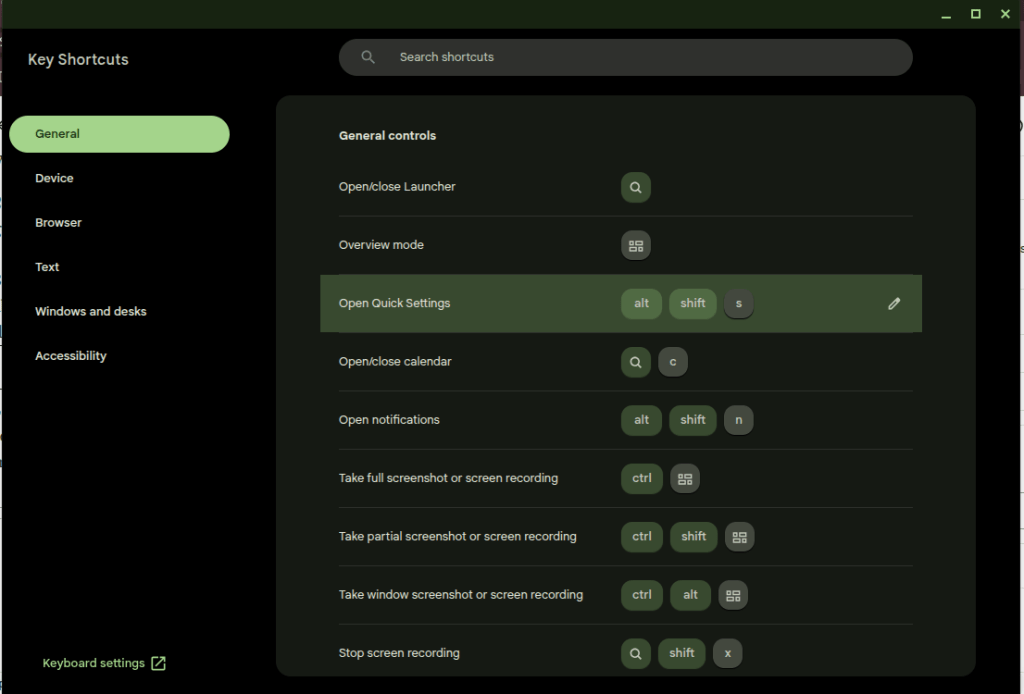
5. Many of the useful keys people want on a computer have been replaced with useless buttons. I’ll trade the Fullscreen and Refresh buttons for the “Home” and “End” keys. Google knows this is a problem because they had to build the whole app in the screenshot down there to explain the arcane grimoire of shortcuts needed to replace the keys they decided I don’t need.
Thank goodness I can put this browser window in Fullscreen mode at the press of a button, though.
That’s enough for now. I don’t hate the player; I hate the game. I want to make my own decisions about how my computers should work, and that’s not the game for a cheap Chromebook. That’s what Linux is for, no?
I pay $20 a month for the “privilege” of editing PDFs.
I understand there are other solutions that allow me to do this for free or at a fraction of the cost. I’ve tried many of these over the years and found that Adobe’s solution works best for me as a production tool. Having reached that conclusion, I don’t mind paying for it.
Lately, however, Adobe is making it hard for me to continue paying this fee. Every time I open the app, close the app, or even just move the mouse to the wrong portion of the screen, I am bombarded with advertisements.
First there is the startup ad. The first time I open the app, every day it seems, I’m presented with a popup detailing new features I might be interested in trying. I must engage with this ad, either positively or negatively, to proceed. It’s like a little toll my brain must pay to start working with PDFs.
(Note: I had already cleared the irritating popup which prompted this post yesterday before I had a chance to grab a screenshot. I knew that if I came back today I would get a new one, and bingo! there it was.)
Checkout this fun popup that I’m paying to see!
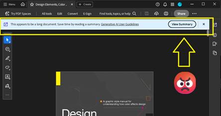
Thankfully I don’t need to close an ad like this every time I open the app for the rest of the day, but every time I open a document, I can be certain that another dialog recommending an AI summary will appear at the top of the screen. Let’s leave for another day the question of whether an AI summary is good for me, good for society, or whatever. Today I am irritated by the simple cognitive labor I have to do every time I open the app to work, to learn, or even just to read for fun. This dialog doesn’t obscure the document, but it consumes valuable real estate on my screen that I often can’t afford to give up. I have to think about it instead of what I’m reading.
Here’s a super-cool dialog that is just big enough to be a distraction. Yay!
After I’ve closed this dialog, I’m still not done dealing with distractions. If I make the mistake of moving the cursor to the bottom of the screen, another dialog appears. Not only does this dialog require another little jolt of cognitive labor to acknowledge and clear the distraction, it creates a slight disincentive against moving the cursor while reading. Worse, this one obscures a portion of the document for a second or more after I move the mouse away from the Hot Zone.
This thing… this thing just really gets under my skin.
There’s something else about this dialog that drives me crazy. It activates a feature that is already controlled by a button at the top of the screen.
Here is the button that is supposed to activate an AI Assistant dialog like the one (but not the same one?) that automatically opens at the bottom of the screen when I move the mouse to the wrong place. It’s got fun colors!
If I wanted to use this feature, I would click the brightly-colored button at the top of the screen! This drives me crazy because the application shouldn’t just execute a command on my behalf – especially not when it has recommended the feature on startup and then reminded me of its existence again and again with popups, dialogs, and colorful buttons. Don’t treat me like a stubborn child who needs to be forced to eat his vegetables. You say you don’t like it, Adobe asks, clearly the wise adult in this exchange, but have you even tried it?
What an insult.
On this computer I pay the bills. If I want to use the damned feature I’ll damn well click the damned button.
This insult poses a philosophical challenge as well. Ask yourself: when is it OK for a machine to operate itself? The deal we’ve made with machines is simple: operators should be the ones operating them. The machine should not operate itself unless the operator has instructed it to do so, or failing to perform an operation would risk injury. When it executes a command on its own, the resulting operation should be limited in scope and duration.
Perhaps a car offers some good analogies. In my car, the headlights turn on automatically when it gets dark because I’ve turned a switch—that is, issued a command—for them to operate that way. If I don’t turn the switch, they don’t turn on. The radio doesn’t randomly change channels to introduce me to new stations (yet). It doesn’t turn on at all unless I press the button. The engine doesn’t change to Eco Mode automatically when I cross the border into a new state. The things that do operate without my explicit command, such as the automatic door locks, do so because the risks associated with error are grave. If I don’t lock the door, it may open in a crash. You can imagine the consequences. I’m willing to hand over a little piece of my autonomy to the machine here.
Does this example of remote execution, this magic AI Assistant dialog, pass that test?
In my most uncharitable moods (like the one shaping this blog post) I think about how failing to click the “Ask AI Assistant” button threatens the careers of all the managers who are responsible for driving user adoption of AI at Adobe. I suspect that Number of Impressions—that is, eyeballs on the AI Assistant feature—is a KPI they can boost by displaying this dialog at the bottom of the screen when I move the mouse down there. When I’m in these dark moods I think that’s a dirty trick to pull on me. It’s especially low down when I’ve been kind enough to allow you to reach into my bank account and automatically withdraw $19.99 every month.
Believe it or not, we’re not done with adverts yet. After capturing the screenshots for this post, I clicked the OS window control to exit the application and close the window. To my amazement, the popup below appeared because I tried to exit without saving the document. Unlike the magic AI Assistant dialog, this could have been helpful! Alas. Rather than simply prompting me to save my changes, some manager at Adobe thought this would be another fantastic opportunity to sell me on a product feature by using dark patterns to drive my behavior. “Share for review” is bright and welcoming. Simply press Enter, it suggests, and turn on the light. And that WhatsApp logo is a big green light saying Go, Go, Go. “Save without sharing,” in contrast, is dark and foreboding, like the mouth of a cave—clearly a button for dullards and dimwits to press so they can stay in the Dark Ages.
They’ve got you coming and going. I pay for this.
Adobe isn’t alone here. Companies are taking these liberties too often. Just today, for example, Teams informed me when I started the app that there was a brand-new Copilot feature for me to try. I have to use Teams for work, so I spend a huge portion of my life—like it or not—staring at this application. I didn’t ask for this. I didn’t opt-in, and I can’t opt-out. My employer didn’t request the feature. But, nonetheless, there it is. A group of managers and devs forced me and millions of others to just live with this thing for eight or more hours per day and hundreds or thousands of dollars per year. And if we don’t care about the feature enough to click on it, they’ll find new ways to remind us that it’s there. I expect to see more popups, more nudges, brighter colors, shimmering icons, and other ruses from the big bag of user psychology tricks reminding me to Try Copilot! until the next KPI comes along that incentivizes Microsoft to arbitrarily and unilaterally change the app again and surface new features.
Adobe ain’t alone. This thing I didn’t ask for had a “helpful” little popup to announce its arrival as well.
I see this happening every day in web apps, mobile apps, desktop apps, even the operating system itself. And before you swing your boots up into the stirrups of your high horse, I know I can use Linux to avoid most of this. I know I can use open source tools. I’ve used Linux as a daily driver on my personal machines since 2007, and I was using open source apps before that. It doesn’t matter. If I want to put food on my table I have to use these products controlled by Microsoft, Adobe, Apple, Google, Esri, Autodesk, and all the other companies who do these short-sighted, authoritarian things to try to alter my behavior and shape my daily existence. I can’t escape it, and neither can you.
But still, if Adobe could chill with the ads in Acrobat, even just a little bit, that would be nice. Until then, I’ll be over here closing popup adverts and keeping my cursor at the top of the window.
(Edit 2/11/2026: It pleases me immeasurably that this post seems to attract bots for SEO and Sales blogs trying to build an audience. Keep those likes coming. Irony is an artifact of the past. -CBC)
TikTok is the future of web browsing. You won’t surf the web; it will be served to you “algorithmically” instead. After a while you’ll be served the content you want and it will feel like it was your idea all along.
AI is the engine to do this. The AI feed will repackage the web, all of the books, all of the recorded audio, and all of the video (which it has already consumed) and deliver it in a feed. You will open the browser and the content will appear. You will scroll and new content will appear.
This is basically the Facebook News Feed or TikTok FYP, but there is a crucial difference. Content there still leads users away from the source. People make the content (or prompt it); people (or their scripts) post the content. They need you to click on it and they want you to follow them off the feed. It’s a dialectic twisted around revenue. Facebook and TikTok want you to keep scrolling so your eyeballs roll over their ads, but Facebook and TikTok need content from users to keep you coming back. Creators who post there want you to click on their content so your eyeballs roll over their ads (or you send them money directly, but they need Facebook or TikTok to put your butt in the seat.
The AI Feed will certainly be burdened by its own internal contradictions, but it will escape this dialectic. Users will stay on the feed because it can endlessly generate content in a way that makes them feel like they’re unique, living on the cutting edge of information, and in control. Creators may post on their own sites (like this one!) but, lacking the “algorithm” and the network effects of a major platform, they will labor in obscurity. Further, the Feed will just consume their content and repackage it.
Maybe the Small Web will come back. Maybe print media will come back. I’ve explored both of those ideas in this blog at many points in the last ten years. Or maybe the AI Feed will be amazing. Who knows? The only certainty is change, change, change.
TRIRIGA/MREF GIS Queries must Include GIS Latitude and Longitude and these must be labeled “Latitude” and “Longtitude.”
This is a quick note in case anyone is struggling with the same problem I encounteredcaused today.
Here’s the scenario.
You’ve got a GIS portal section in TRIRIGA/MREF.
You’ve created the GIS Map record that powers the section.
You’ve set up the extent, configured your basemap(s), connected to one or more data sources for layers.
You’ve created a “GIS Query” record to display TRIRIGA data on the map.
For most of you, it probably just works. Congratulations! If you’re a grug brain like me, though, read on.
No matter what you do, the map doesn’t work! It’s so broken, in fact, that the portal is unstable and your browser reports that the page is unresponsive.
If that’s you, what now?
The TRIRIGA documentation says it plainly enough: “Queries must include display columns that are labeled Longitude and Latitude. The Latitude and Longitude fields pinpoint the item on the map.”
After spending a couple hours today troubleshooting a GIS query, let me make it even more plain.
Make sure your query includes the Location Business Object and (of course) the correct association string.
Add the triGisLatitude and triGisLongitude fields from the Location BO to the query.
Label these fields Latitude and Longitude. This step is important! The fields are called “GIS Latitude” and “GIS Longitude” on the BO, and that won’t work.
Save the query, reload the portal, and voila!
Now I must confess what I did. Learn from grug.
grug see GIS query has longitude and latitude but TRIRIGA locations have no latitude and longitude data
this bad — it mean no TRIRIGA points on map
grug see GIS layer from ESRI includes ID
grug think user need way to open TRIRIGA record when they see something interesting on map
grug see “Show Table” on map viewer and see that records can be opened from the table
grug get idea
maybe user click on “Show Table,” find what they need with ID, and open record that way
this not great, but only option
grug change query to show data shown on GIS layer
grug think user no longer need latitude and longitude on query because these always blank
grug delete latitude and longitude from query because efficiency good
now portal no work and browser mad at grug when page load
grug try fix many ways until stop and eat lunch
maybe read documentation will help, grug think, but it only help a little
after few more tries, grug find answer and then write answer here
If this helped you, hello from the past! If you’re inclined, leave me a comment.
No matter what you do, odds are that a significant amount of your time doing it is spent answering emails. That is certainly true for me. Email is a unifying thread across my professional and creative life. It directs the course of my days at work and my nights playing music and making art. As a result, it is the first thing I check in the morning, the most important part of my workday during the week, and one of the last things I look at before I go to sleep at night. Everyone I know is in the same situation.
A literal mountain of emails. Image produced by Microsoft Copilot.
It’s too bad, then, that email is all wrong. Though email is such an important part of my day, none of the email tools I’ve tried offer any of the things that I need to respond thoughtfully and keep myself organized. Email web apps limit you to accounts provided by that host or require you to do a bunch of weird setup to look at other accounts. That’s before looking at any of the tools these providers offer. Thunderbird is stuck trying to emulate the way Outlook worked in 2007. Outlook—the default, required client for most users—offers notes, tasks, folders, reminders, rules, and integrations to other Office software, but at the end of the day every email that flows into the application looks and feels the same, and every important tool exists somewhere else on the reader’s machine. It’s up to the reader to categorize, prioritize, leverage the right tools, and follow-up on their messages. Most readers are OK with that responsibility, but the sheer volume of email we have to deal with everyday can make it difficult to faithfully execute this responsibility.
Here are the main problems as I see them:
Every email in every client looks and feels the same by default
“Reading” is the objective. For many users, when an email is “read,” it is filed away for further action in the same pile with things that don’t need action. Important items can fall through the cracks unless the user deploys some secondary processing method. These methods vary widely by user but may include flags, folders, tasks, changing the status back to unread, or (more likely, I suspect) some combination of everything the interface offers in a desperate bid to stay on top of it all.
Every item must be read in order to be processed. See above.
All of the most important tools—word processors, spreadsheets, web searches, IM clients, checklists, and so on—exist somewhere else. There is no connection between an email which triggered a process and the tools needed to complete it.
This is also true in the archival sense. Often an email and its attachments are the only evidence of work done. These are only the most superficial products of deeper processes which are documented on both local and remote file systems.
Lately I’ve been thinking about a different kind of email tool. I’d like to have an app where I can build process templates and drag emails to “anchors” for those processes. Dragging an email to the app would create an action item, and the process anchor would follow rules to provide the specific tools needed to complete the item.
Let’s say you have a standard process you typically need to support from email. For example, for several years my job looked like this:
Receive an email with an assignment
Create a folder on a filesystem on the enterprise network
Populate this folder with certain templates
Collect information from the internet and other emails
Use this information to complete the templates in the folder
Submit a link to the folder to a reviewer
Revise items based on the reviewer’s comments
Send approved items to a customer
Archive work products in an online repository
In my platonic email app, I would drag the assignment email to a process anchor in the app. This process anchor would increment an action item counter and then follow a rule to create the folder, populate it with templates, provide a list of links to the places where I need to gather information, give me the ability to open the template documents and work them right from the application, automatically send a message to the approver when I’m ready, automatically email the customer, and then pop a link to the repository upload (or, in an even more perfect world, use an API to upload the work products). After completing the process, the action item counter would decrement.
Each action item associated to the anchor would have its own workspace, which would include other tools like a notepad and calculator. Similar anchors would exist for other processes configured by the user, surfacing different tools and following different processes set in advance. These processes would be configured with natural language rules, like Monday.com automations.
Anyway, I doubt I’ll ever have the time to build this tool, but I’m always looking for it. In the meantime, maybe just writing out the ways that I think email is wrong will help me be more thoughtful about how to make it right with the tools I already have.
Computers should be bicycles for the mind, but with email we are trudging through confusion.
Call it a passion project. The past few days in my spare time at work I’ve been recovering data from twenty-five and thirty-year old floppy disks. The files on these old disks—CAD drawings, meeting minutes, reports, and other construction-related documents structured in 1.44 MB or smaller bundles—are interminably boring, but there is something intellectually thrilling in the process of accessing and reviewing them. I’ve been thinking of this as an archival thrill, similar in the little raised neurons it tickles to the feeling I get when chasing leads in old newspapers or digging through a box of original documents in search of names, clues, faces. Entire careers have come and gone since these files were copied to the magnetic circles in their little plastic cases. Whole computing paradigms have risen and fallen in that time, and, with them, our own sense of technical superiority to the people who authored these files. Still, the same meticulous attention to detail is evident in the files, the same sense of their own sophistication on the part of the authors, the same workaday problems we are solving today.
Working the files, I noticed two more things:
The sound of a physical device reading data is special, and it can be deeply satisfying. I had forgotten the audible experience of computing—the whining, clicking, tapping, and whirring which used to characterize the entire experience. All of this is gone now, replaced by the sterile sound of fans, maybe, like wind blowing over a dried lakebed. There are audible affordances in physical media. When the sound stops, for example, the transfer is finished. When the button clicks on a cassette tape, the experience is complete.
The old files on these disks are authored with maximum efficiency in mind. With only a few hundred KBs to work with, designers had to get creative in ways we don’t today. There are a lot of pointillistic graphics, tiny GIFS, plaintext, line drawings; none of the giant, full-resolution graphics we include everywhere today.
One of the disks contains a full website, preserved like a museum piece from 1999. Clicking around those old pages got me thinking about the archival thrill of the old internet.
Consider the way that the most prominent metaphors of the web have shifted over time.
It used to be that people would surf information on the internet, riding a flow state wave across documents and domains in pursuit of greater knowledge, entertaining tidbits, or occult truths previously hidden in books, microfilm, periodicals, letters, and other texts. The oceanic internet held out the sort of thrill you feel when wandering among the stacks of a vast library or perusing the Sufi bookstalls of old Timbuktu. It was an archival thrill, tinged with participatory mystique, abounding with secrets.
In the heady days of the early web, to surf was to thrill in the freedom of information itself.
When Google arrived on the scene and began its ongoing project of organizing the information on the web, feeding took the place of surfing. This act, like every triumph of industrial capital, relied first upon the extraction of surplus value from the laborers who produced the commodity—i.e., the authors of the information. That is a subject for another day. More to my point in today’s rumination, however, Google’s revolutionary commodification of the web also took advantage of the customer’s innate narcissism. You have specific and important information needs, Google says with its design language, which this text bar can satisfy.
Google delivered on this promise by surfing the web on behalf of searchers. To deploy another (very stretched) oceanic metaphor, Google turned surfers into consumers of tuna fish. Each search serves up a little can of tuna. Enter a term in the box and out pops a little tin; pop the can and get what you need, increasingly on the first page; and then get on with Your Busy Life.
The YourBusy Life warrant is the play on narcissism. You don’t have time to surf, it says, because you are important.Have this can of tuna instead.
I love tuna. I search every day. Google was so successful, however, that the web wrapped itself around the tuna-dispensing search box. By the mid-2000s, users no longer used search primarily as an entry point to the waves but, rather, as a sort of information vending machine serving up content from Google’s trusted searches.
Beginning around 2008, feeding completely overtook surfing as the dominant user metaphor of the web. As Infinite-scroll apps on smartphones took the place of websites, the purveyors of these apps took it upon themselves to predict what users would like to know, see, or do. To this end, the most talented software engineers in the world have spent more than two decades now building algorithms designed to settle users in a stationary location and serve them little morsels of information on an infinite conveyor belt. Cans of tuna became Kibbles and Bytes, piece by piece, scrolling past.
The participatory mystique, or archival thrill, as I have called it, has been almost completely displaced by this dull feedlot experience. I know that the old experience of the web exists alongside the new, that I could go surfing right now if the urge carried me away, but I lament that so many of the people who could be building more and better websites are building cans of tuna for the Google vending machine on the web or Kibbles and Bytes for the apps.
I have just finished Will Blythe’s searching essay on the future (and present) of literary fiction at Esquire. I’ll let Blythe’s argument stand for itself, but to briefly recap: the web, and the devices we use to access it, are radically splintering attention spans. This has already dramatically reduced the viability of literary fiction in traditional venues, he argues, but may spell serious trouble for the future of the literary novel, as well. It’s a powerful, sobering essay. I have thought and written at some length about digital tools, reading, and distraction in these pages, and I largely agree with Blythe on the impossibility of serious, focused thought in our current technological paradigm. I don’t have anything new to say on the subject of distraction, but I did have some thoughts about technology while reading the essay.
When we say “Technology” in 2023, for most people that means smartphones and apps.
This is not just how things worked out. It doesn’t have to be this way. Technology can foster immersive experiences as well as it can splinter attention spans. Technology can contribute to a flowering of literary fiction as readily as it can spell its demise. Technology could give us more literary fiction, more genre fiction, more historiography and literary criticism, more poetry, more everything, as well as extremely powerful tools to annotate, index, summarize, and recall all of these texts.
In fact, technology has given us all of these things. Take a spin around the listings of online literary journals at Duotrope. Look at the insane library of classic literature, periodicals, and texts of all kinds at Project Gutenberg or the Internet Archive. If you are an inveterate notebook-keeper, like me, look at Joplin or OneNote (just not Evernote any more, after recent changes, including a massive price hike). Or just take a look at Notepad and a filesystem. If you take notes specifically around books and articles, and need to build bibliographies, check out Zotero. Need an immersive word processor? Check out FocusWriter. I could keep going, but the point is hopefully clear by now: technology feels hopeless and limiting because our definition of technology is too narrow. One need not look far beyond the confines of iMessage or Twitter X to see that technology has radically exceeded the promise of the “Information Superhighway.”
The smartphone is not the best tool for immersive reading, thinking, and working–but not, necessarily, because of some logic inherent to the form. Smartphones are platforms for apps, and the most popular apps steal their users’ attention because that is what they have been designed to do. Take away the distraction-inducing apps, and you would take away the distraction. But which apps are you willing to delete? The makers of these apps know that attention and relationships are more powerful and pleasurable inducements to action than pretty much anything else in the world–right up there with nicotine, sugar, and opium–and using that fact to drive traffic to their apps is how they make their living. They won’t stop doing it until the demand goes away.
Here are some ways to start reducing that demand.
For Users:
Turn off app notifications on your phone for everything except phone and messaging.
Remove all but the most essential apps from your home screen. If you need to open an app, search for it. Bonus: if you keep notifications enabled, you won’t see badges on the app icons to draw you in.
Instead of replying to messages throughout the day, set aside an hour or so for focused correspondence. You can use this time to write emails, check your DMs, or whatever. Let the messages pile up otherwise. In my experience, people understand after a very short time that you will respond later.
It falls upon those of us who build technology and care deeply about attention and immersion to build experiences that foster attention and thought. For developers, then, two quick thoughts:
Resist user notifications at all costs. If your company uses notifications to drive engagement growth and sales, rather than meet legitimate business needs for the user, you work at the wrong place.
Declutter the interface of dynamic elements, like popup hints and user nudges. Clutter it with tools instead. The interface of LibreOffice Writer affords a great example of this principle. Some would call it ugly, and they would be right. I believe it is ugly in the way that a well-used workbench is ugly, however. This is a happy, focused place for those who thrive among their tools. (You might think this doesn’t work well for smartphone apps, but look at how much dynamic garbage Meta crams onto the Facebook app screen. It works.)
My cluttered LibreOffice Writer workbench.A cluttered workbench. Image credit to Circacies.
Let’s broaden our definition of “technology” beyond smartphones and apps, and then use what we find in that land beyond to make apps on smartphones better. If we do that, much more than literary fiction is sure to benefit.


