Trying my hand at book cover design with a classic.

This is a difficult one to capture with a cover. The tone, themes, and plot do not necessarily match the title, but the book is so full of life and characters that anything short of a parade fails to capture its vitality. With this design I am leaning into the title itself.
Other designers appear to have made the same choice with this one.


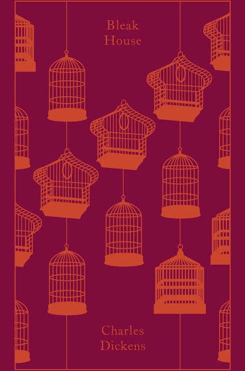
I’m much more fond of the Vintage and Penguin editions below, however. These are much more engaging and do a better job of capturing the story’s themes in a glance.

I still have a lot to learn about cover design, but I think this is a pretty OK first outing. Authors: if you’d like to work with me on a design for your book’s cover, get in touch!
