
Urban Archaeology: Walmart

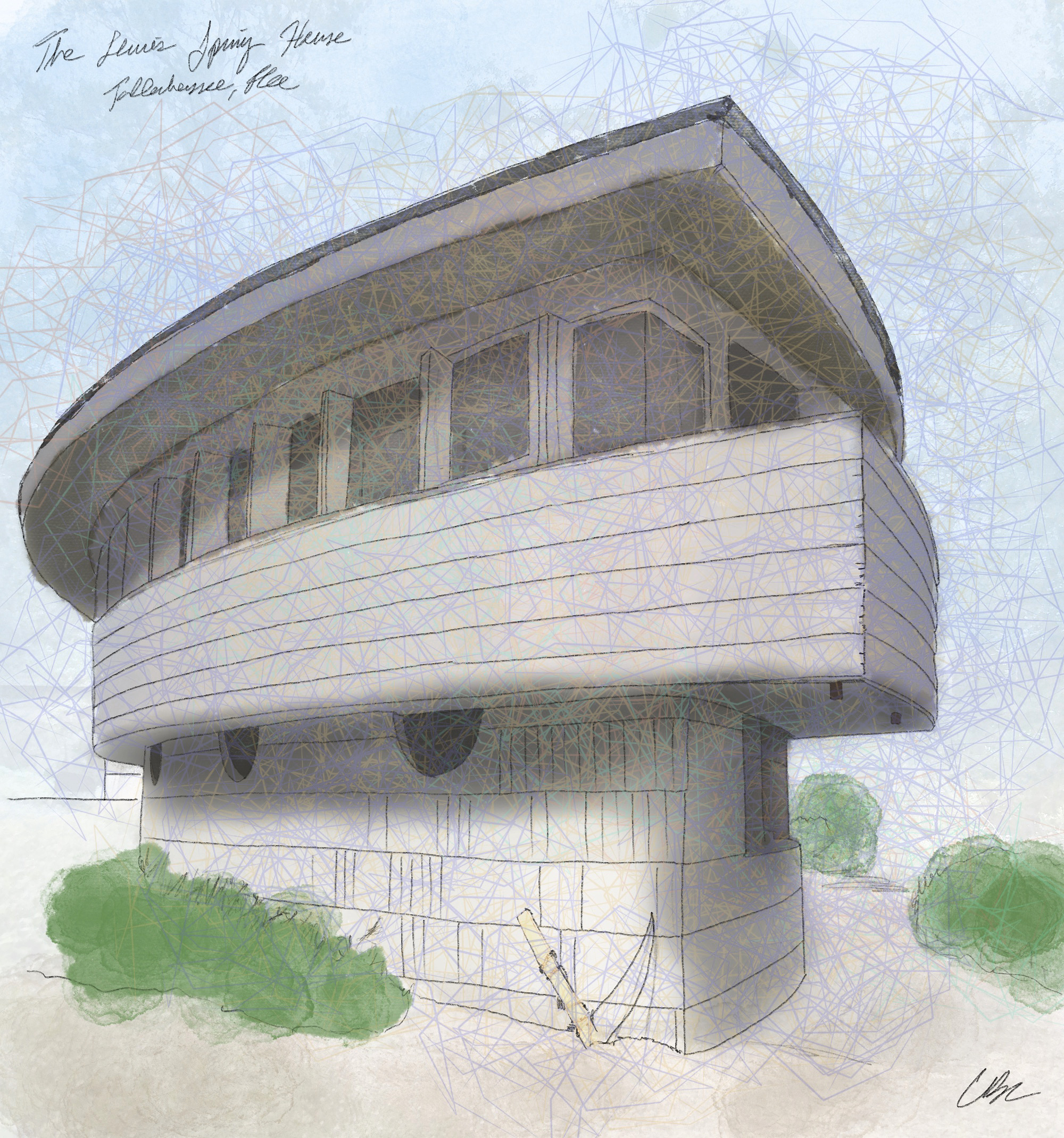
This is the only Frank Lloyd Wright house in Florida.
Trying on helmets* in the reflective fitting room and dodging aristocratic horses at the High Museum in Atlanta.


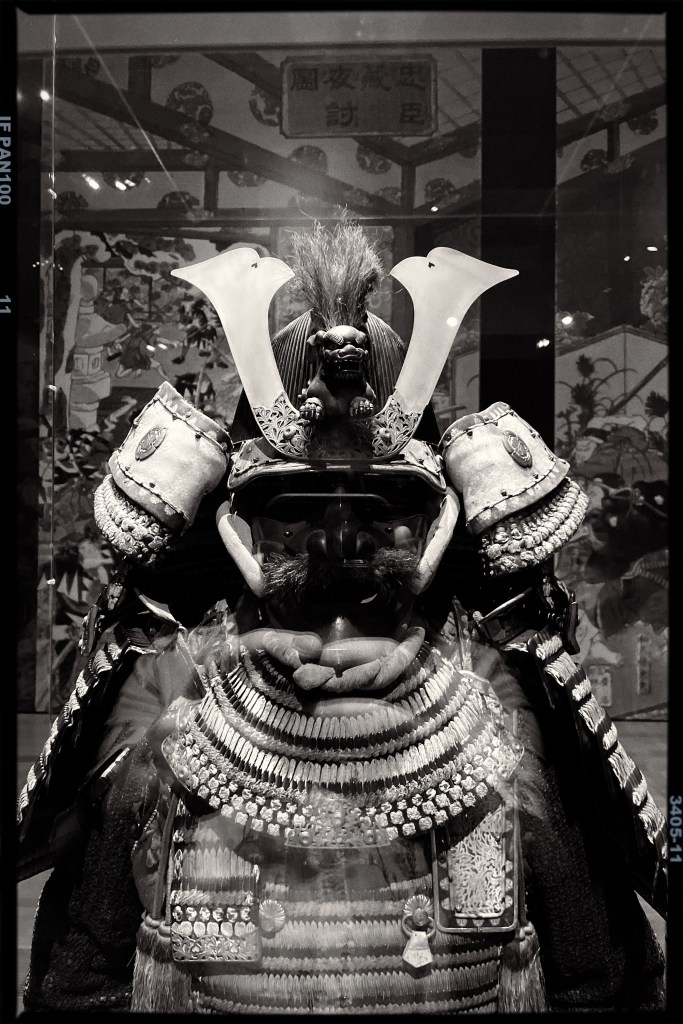
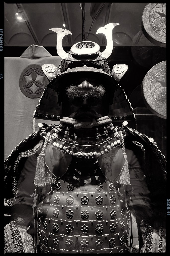
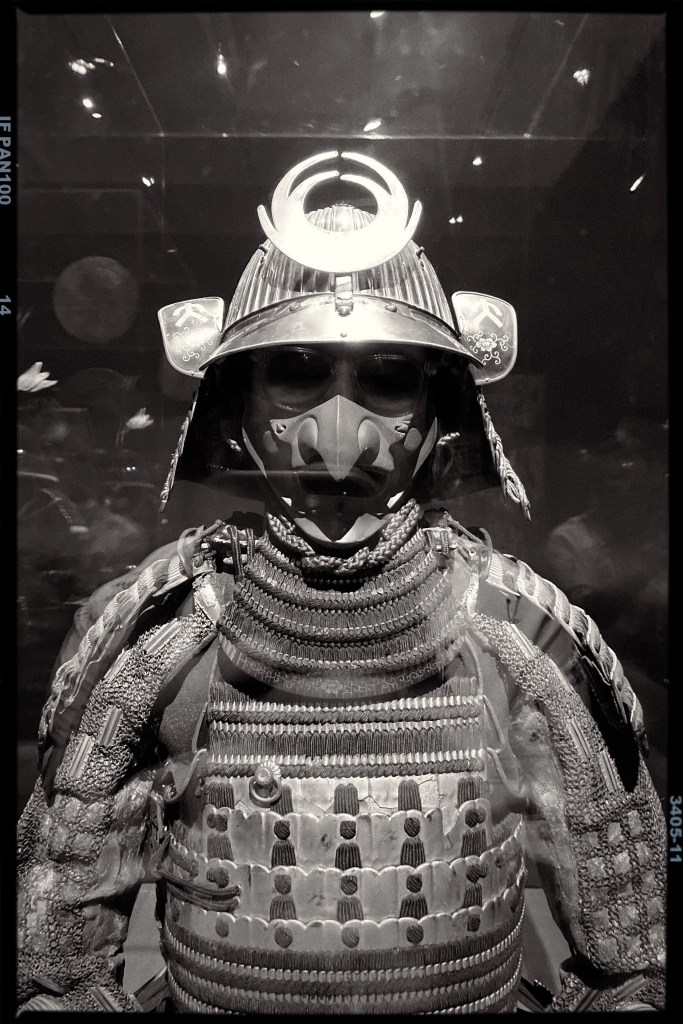


*Don’t actually try on the helmets.
Salvador is alarmed by your behavior.

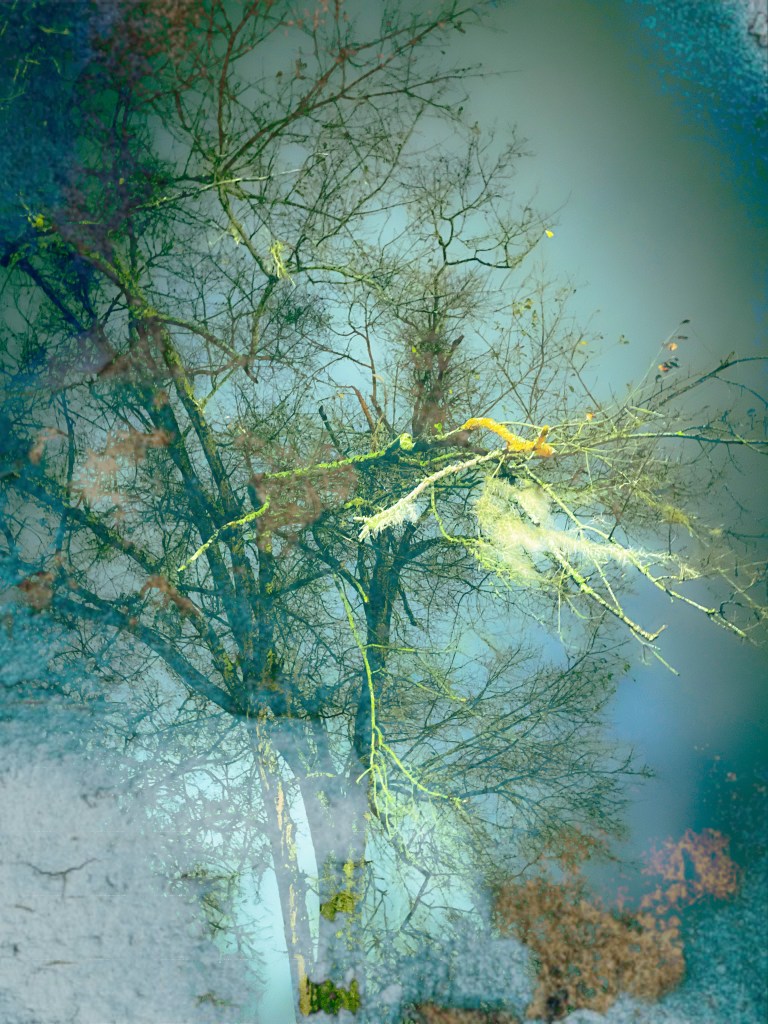
Fooling around in the Procreate notebook.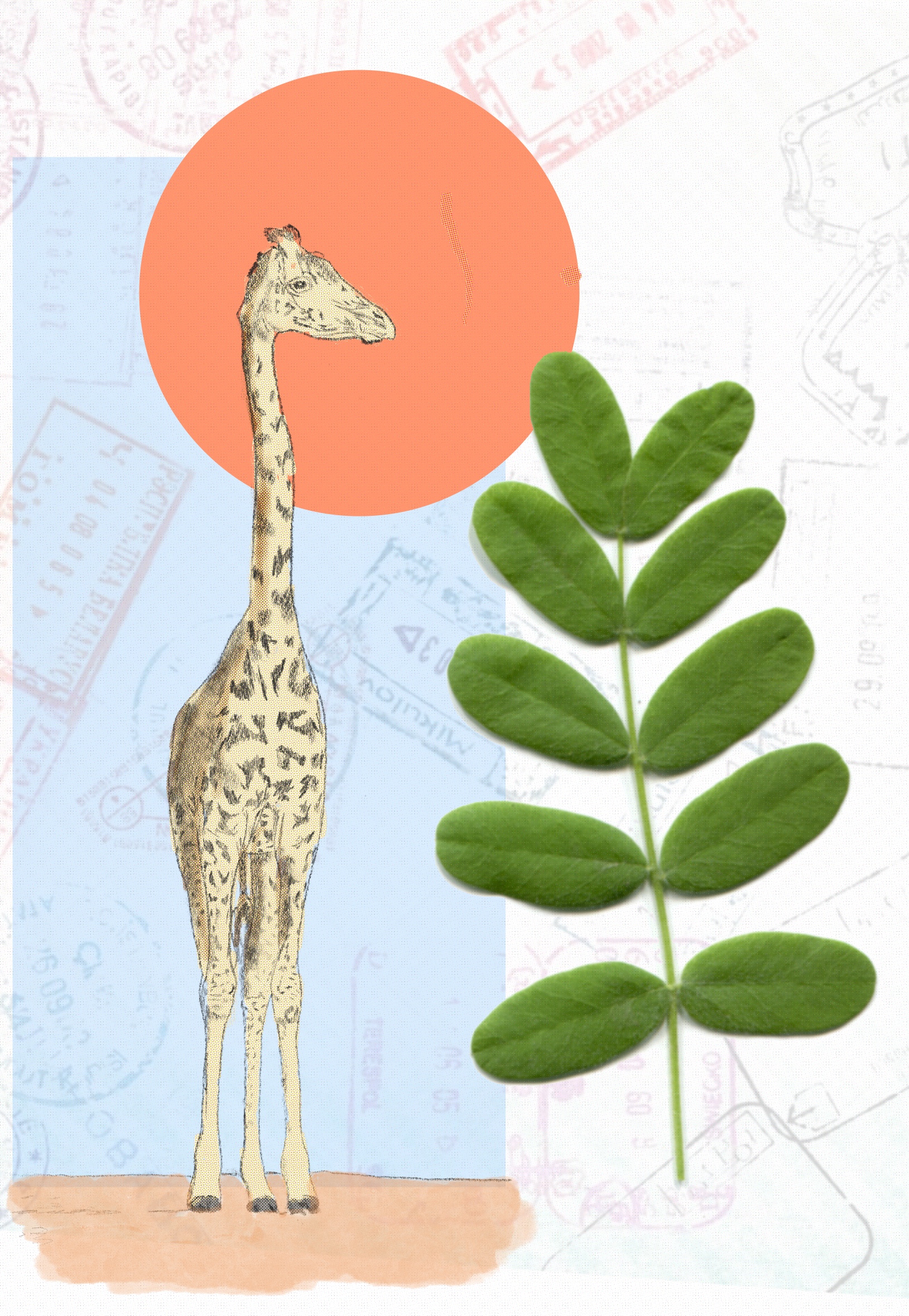
Trying my hand at book cover design with a classic.

This is a difficult one to capture with a cover. The tone, themes, and plot do not necessarily match the title, but the book is so full of life and characters that anything short of a parade fails to capture its vitality. With this design I am leaning into the title itself.
Other designers appear to have made the same choice with this one.


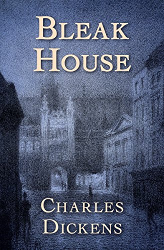
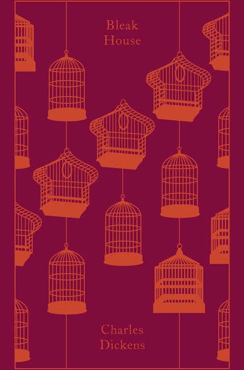
I’m much more fond of the Vintage and Penguin editions below, however. These are much more engaging and do a better job of capturing the story’s themes in a glance.

I still have a lot to learn about cover design, but I think this is a pretty OK first outing. Authors: if you’d like to work with me on a design for your book’s cover, get in touch!

The camera sensor and software render the night over to cold, sleepless ocean softly, indistinct, like a painting by Turner.
All save the stars is the digital perception of impossibility, an attempt to impose photographic order on chaos.
I just stumbled across a post on Instagram highlighting a series of photos printed from negatives rejected by the US Farm Security Administration. These photos were “killed” by agency leadership, who punched a hole in the negative to avoid printing the image.
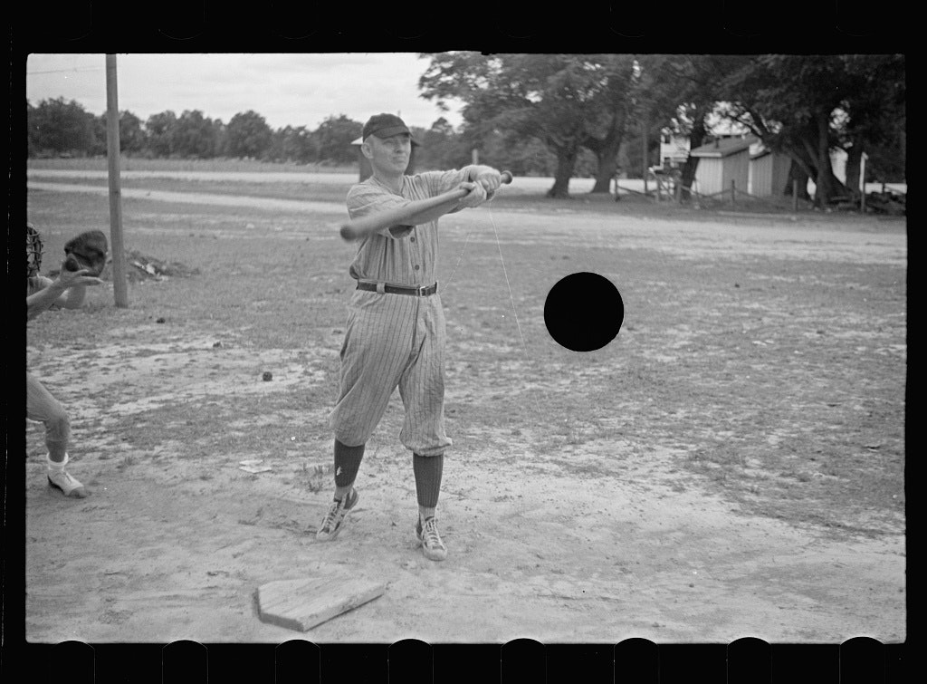
Roland Barthes argued that photographs possess two qualities: “studium” and “punctum.” Studium is an observational quality, the way a photo exists in social, cultural, and aesthetic context. Punctum is a quality which “wounds” the viewer, transcending context and piercing their spirit. These holes–literally puncta on the negatives–pierce the viewer’s spirit by subverting their expectations of the photographs, which were commissioned for strictly “studious” purposes.
These would not be nearly as effective if they did not include the entire film strip in addition to the photograph. This underlines the materiality of the film, the hole-punch, and, by extension, the subjects captured by the image–the flesh and blood existing at a moment in time.
